These logos are quite old but they’re the only works of mine that have ended up as tattoos and appear with some reverence (mostly) in odd places today. I figure they’re worth dissecting a bit.
In no particular order:
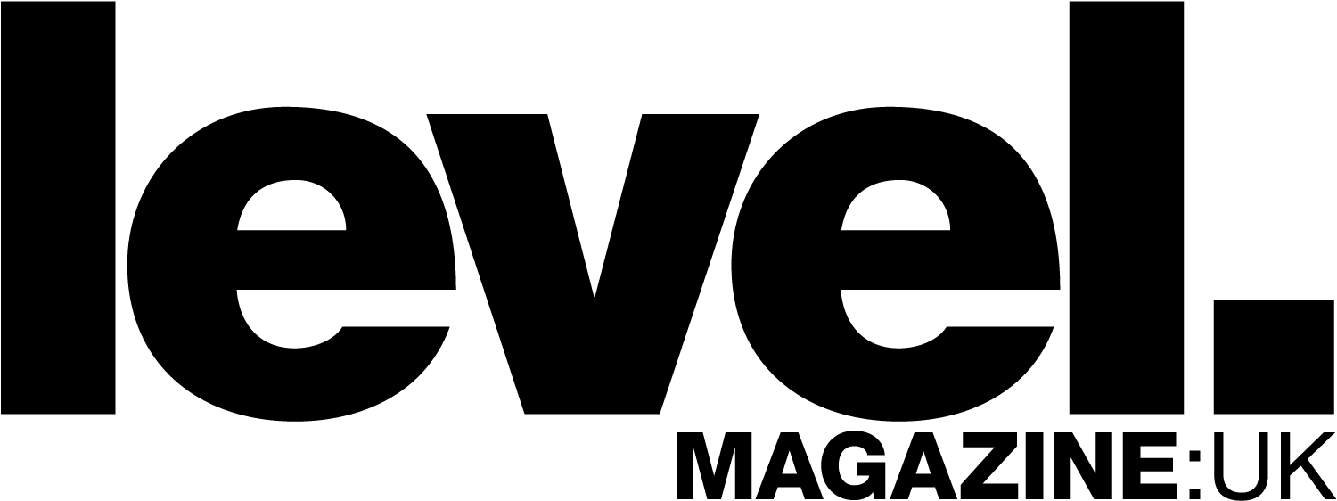
Level magazine was all about clean, strong Helvetica Neue use with purpose. The MAGAZINE:UK suffix appeared only when absolutely necessary.
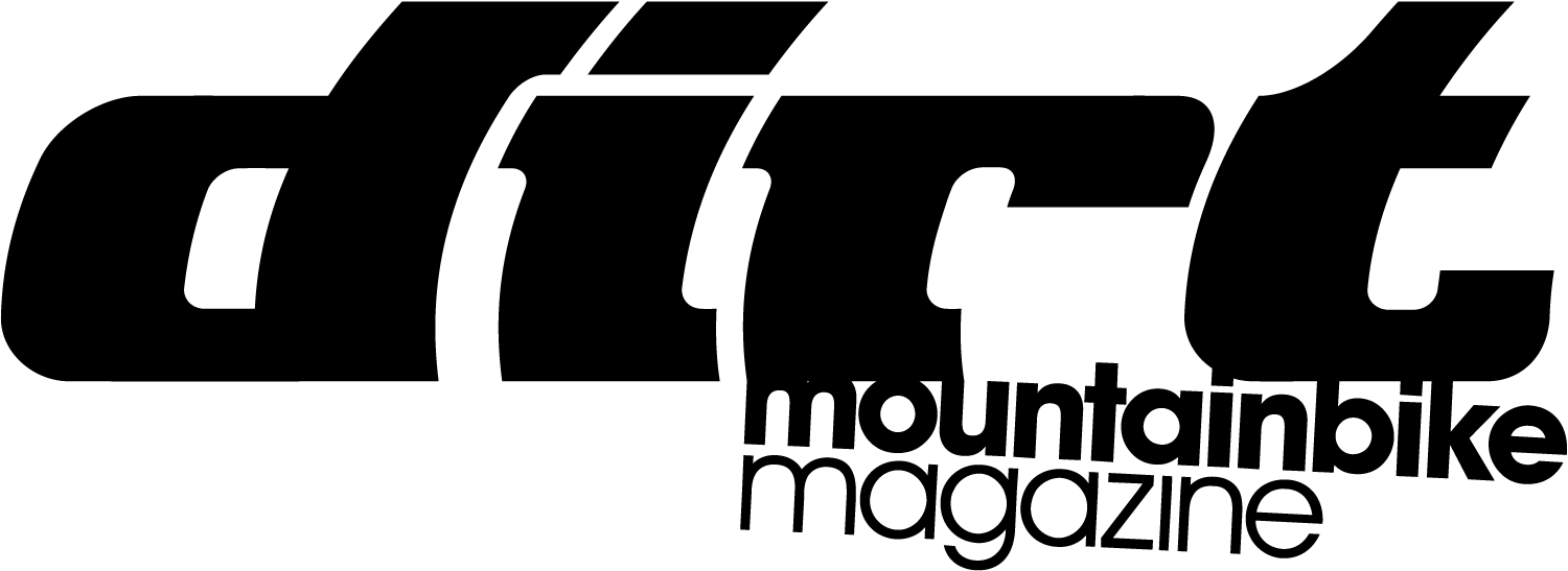
The Dirt mountain bike magazine concept was the brainchild of Gerry Dyer (who’s now mad about big planes) and Paul Bliss (who would always wear his sweatshirts inside-out to the 4130 office). They liked our BMX magazine Ride and pitched us the Dirt mag concept. I can’t remember if they had another name in mind, but my brother/4130 co-director Mark Noble and I liked a then-dead lifestyle mag Mark Lewman, Andy Jenkins and Spike Jonze had done in the USA, so we borrowed its name. As you do. This is the second version of the logo which stayed in use for the rest of the magazines’s days.
Trivia: David Hieatt, now of Hiut Denim, then of Howies, called 4130 to ask what the Dirt logo typeface was. As I’d made its letters from scratch, we couldn’t help him. We assume he wanted to make an ‘homage’ Howies graphic.
Ride was 4130’s original publication. The earliest logo shown was somewhat inspired by the logo for Landini, an Italian tractor company. Originally, this logo had the Japanese katakana for ‘ra-i-do’, shown after, but I don’t have that logo to hand. After I fell for Helvetica Neue, I did the version with my scrawl ‘Magazine’. That didn’t last too long. In the full Helvetica version, I made a custom lowercase uppercase ‘G’ by minutely studying the difference between ‘C’ and ‘G’, and ‘C’ and ‘c’. Nerd alert.
[ For 4130 Publishing Ltd. ]


