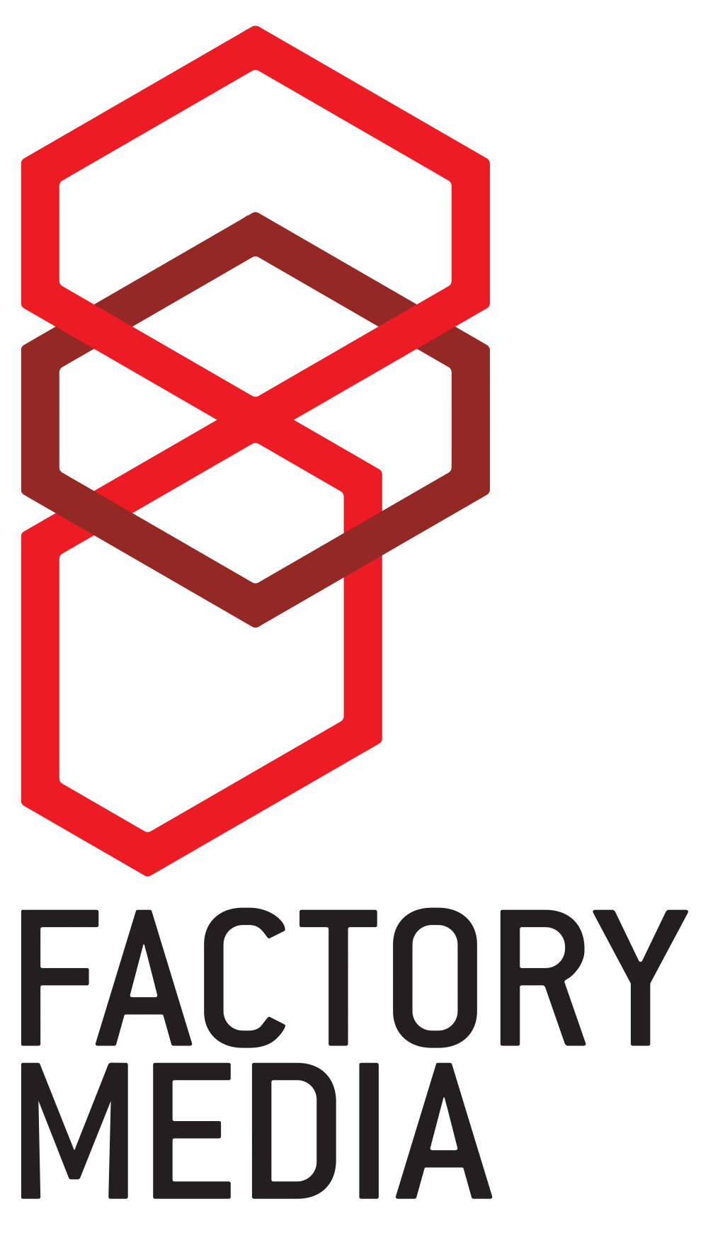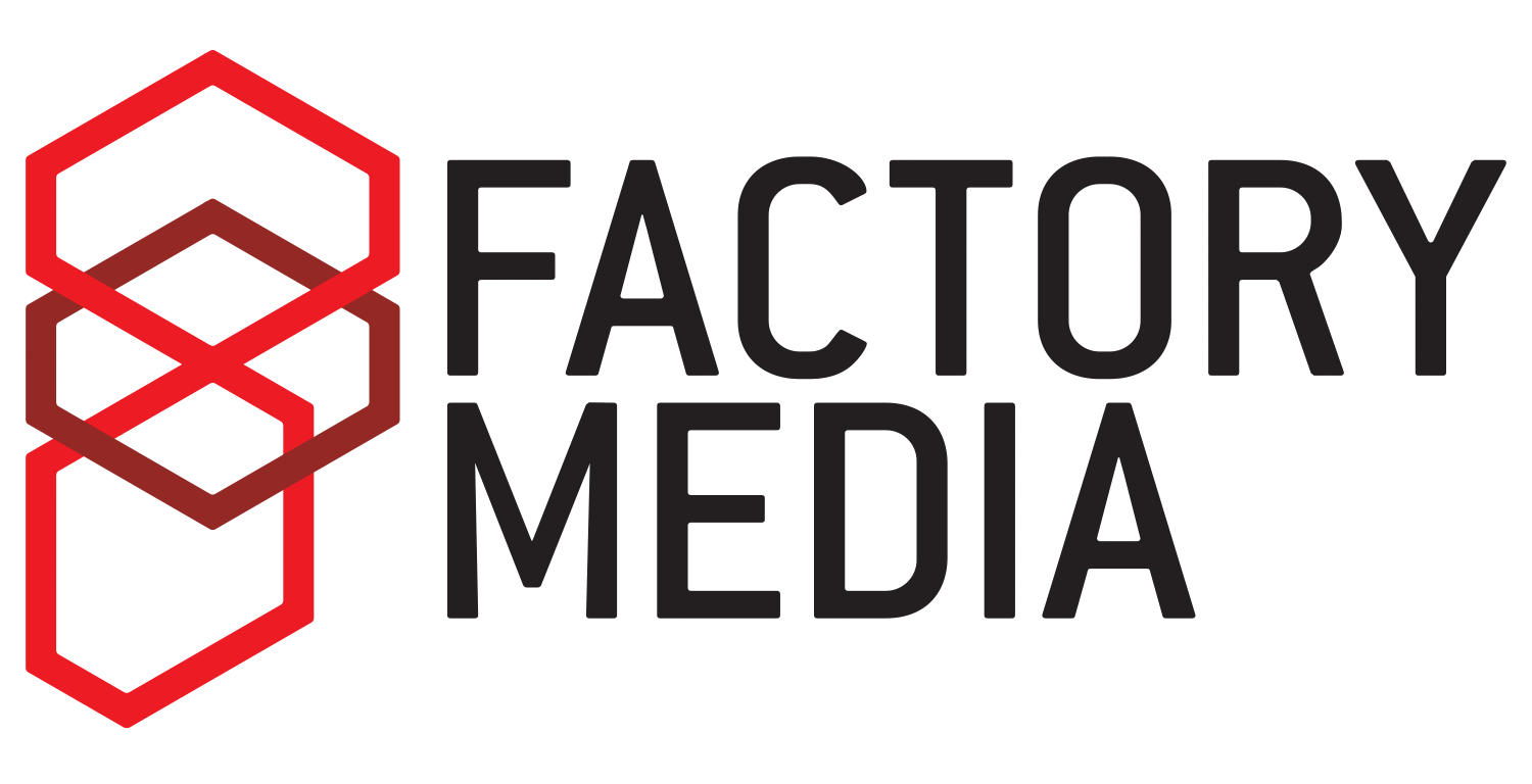
Factory Media was a merging of three very similar companies. One was mine.
While the new company didn’t turn out so great, this proposed logo is untarnished enough in my mind to include it.
The logo is made up of three equal, stylised ‘boxes’ (denoting a ‘factory’ process of sorts) in perspective, forming an ‘F’ for ‘Factory’.
The stacking of boxes looks pretty unbalanced, which would have been appropriate. The new directors ended up choosing a logo a mate did in Akzidenz stencil. That told me enough about their thought process :’(
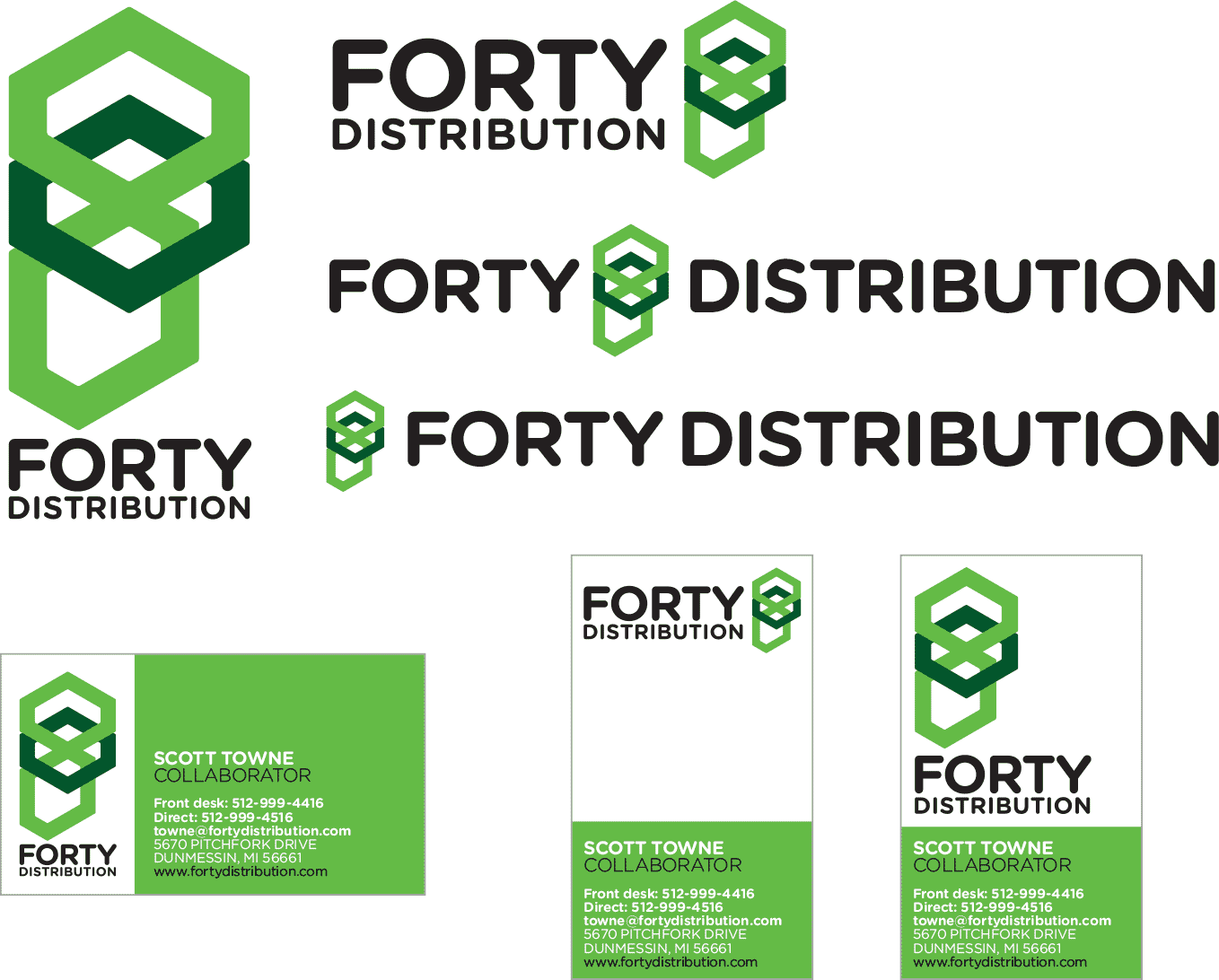
A little while later, a connection asked for a quick logo for their startup, Forty Distribution, and as the ‘F’ and boxes fit the bill there, I fattened up, recoloured and recycled this logo for them.
[ For Factory Media ]