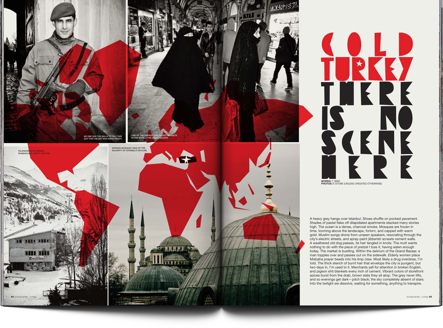
Article design inspiration nearly always comes from the subject, theme or title.
For this article, ancient Turkish letters and a vision of hand-lettered regionally evocative signage in the region — admittedly not researched, it was more of a feeling I ran with — provided the design direction.
I augmented the Dafont title font (using Fontographer) to create an alternate capitals set to reduce nearby repeats of form to support the hand‑drawn type feel lettering. Its extreme justified alignment and transparency adds to the effect.
For the geographically challenged — not saying anything about the target American audience’s grasp of the whereabouts of other countries — I designed a world map, in a style similar to the lettering, for the first spread.
[ For Snowboarder Mag ]