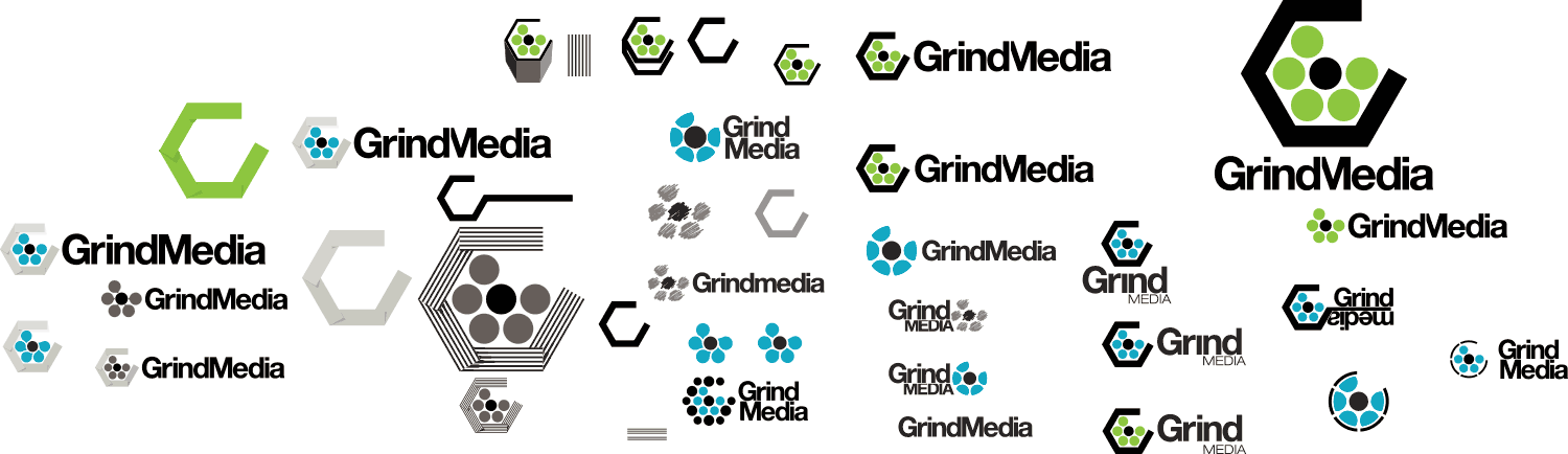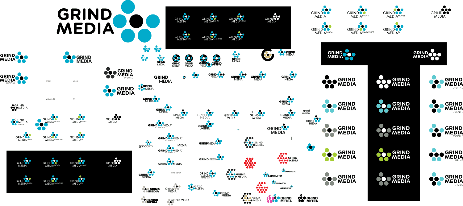
This serves to demonstrate how overthinking a logo can lose all its original simple spirit.
I was working at the publishers that would become Grind Media (as Art Director of Snowboarder Magazine) and they asked me to offer up logo options for the new company. Going in with my simple-icon instincts, early rounds got a little better, then later spiralled into too much going on.
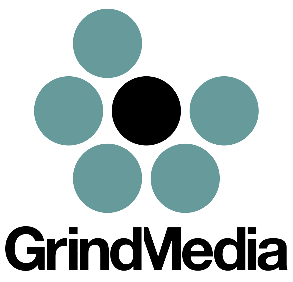
The five-circled Round 3 represents pixels, print-screen dots and the brand’s five main channels — and a ‘G’ for ‘Grind’. Simple.
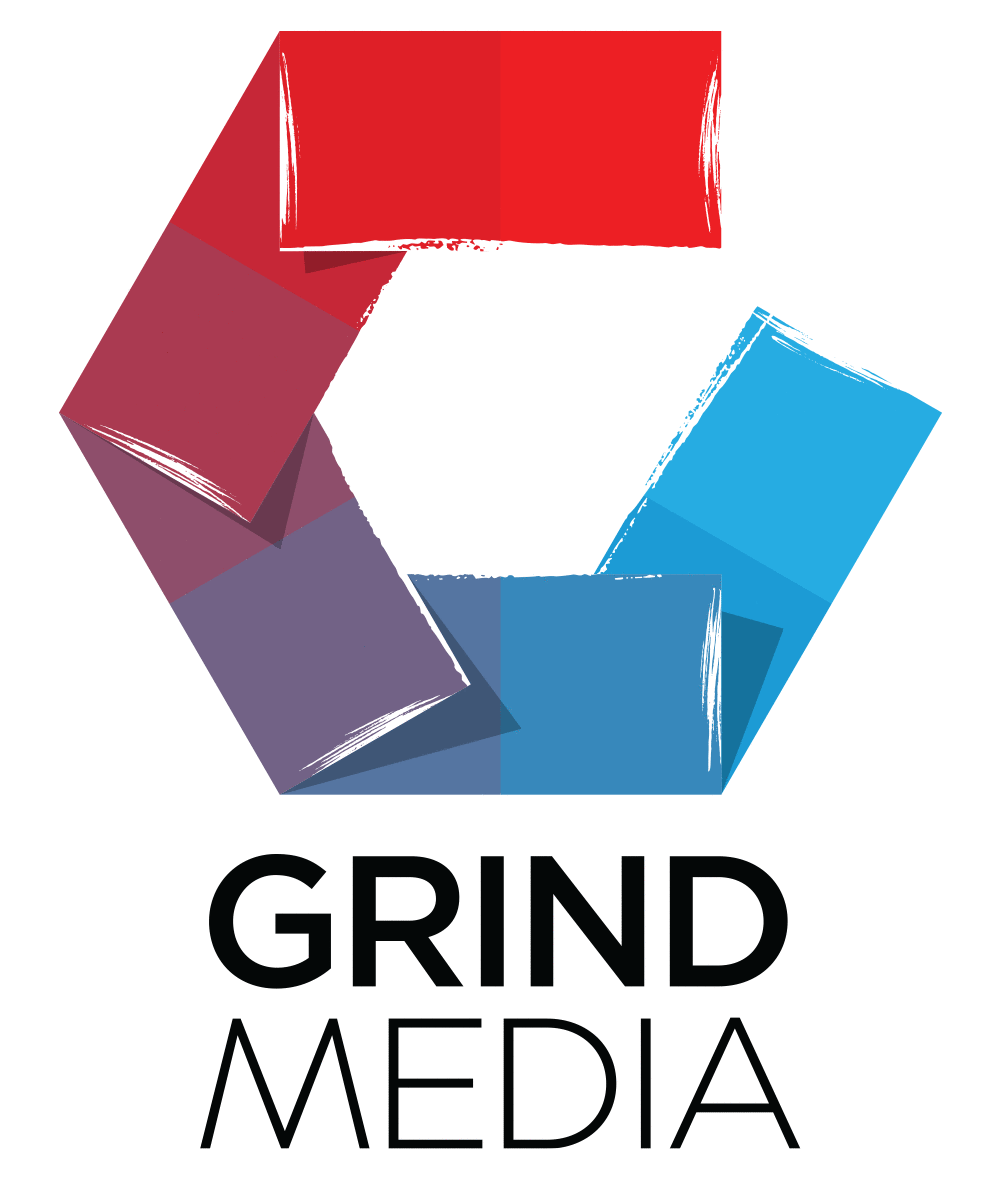
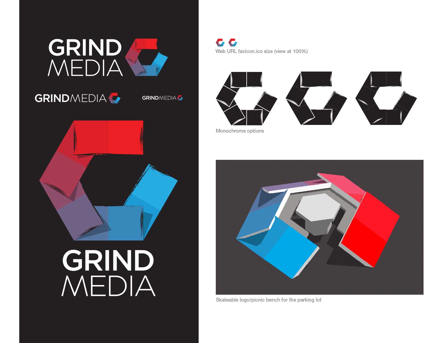
Round 8, the hexagon affair, possibly the most conceptual logo in the history of logos, included at least six solid/tenuous stories about the company — I won’t bore you with the details. It wasn’t the worst logo ever, but to me, it’s just trying far too hard.
WIP artboards also shown. Spirit, be gone!
[ For Grind Media ]