There are times you should avoid stuff that been done before, and times you shouldn’t.
There’s a sliding scale of how likely it is that your consumer (cringe) has already seen it. If it’s likely, do something different. If not, show them whatever’s best for them and you.
If you’re designing an alt-milk carton, don’t make it look like all the other alt-milk cartons just because that’s what alt-milk cartons look like. That’s exactly the reason you shouldn’t do it. Stand out. B/W against a sea of colour; explore a different (at least as practical) shape; unexpected type (or lack of it). A different take on imagery and/or graphics (or lack of it) and dial the words to fit. It ALL has to fit within its own system. Just make your own system.
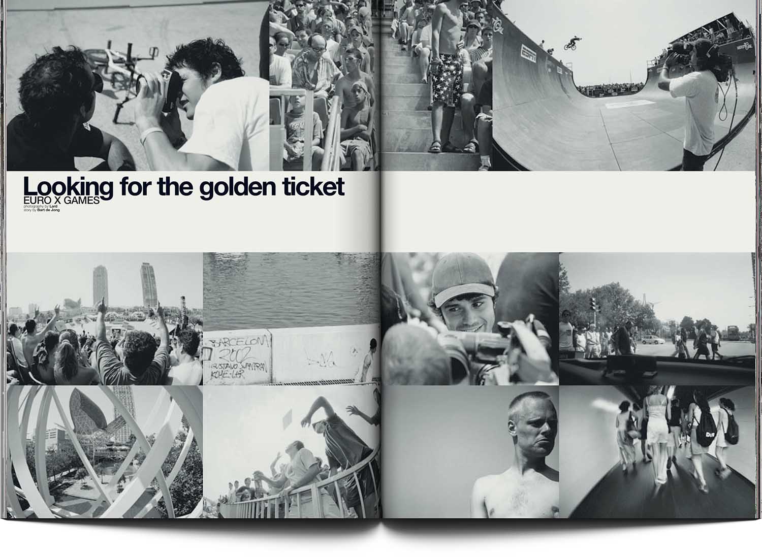
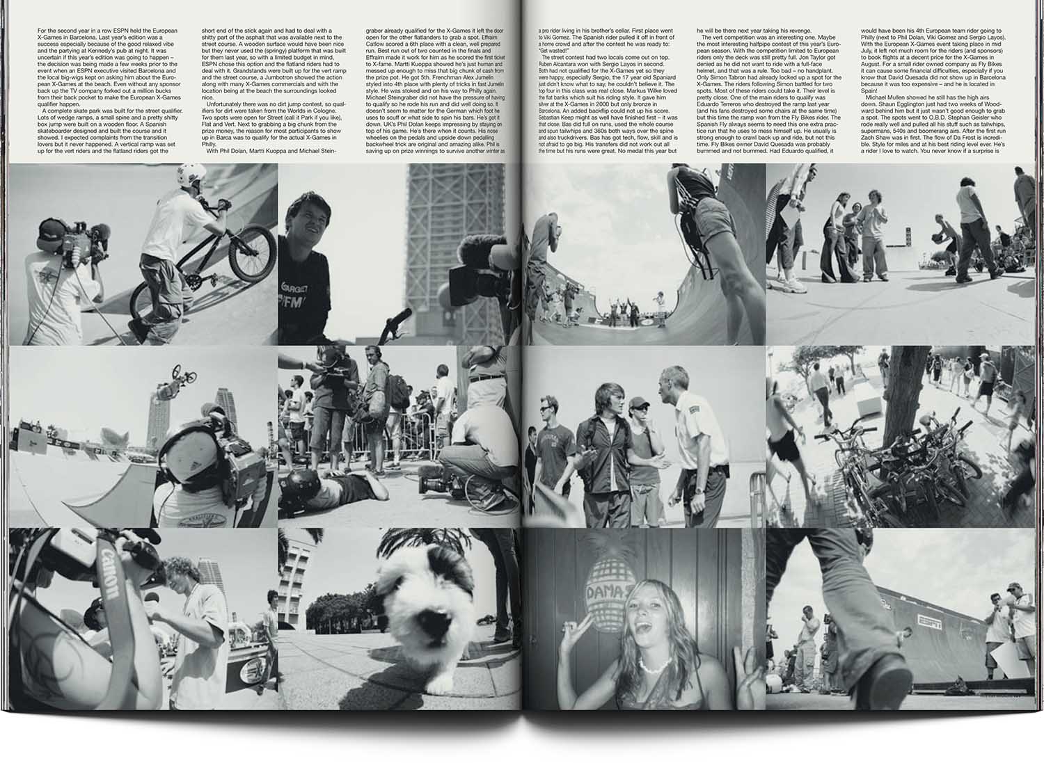
I’ve gone off subject. So, X-Games. Everyone’s seen the X-Games on TV: riders getting rad, flips all the ways, triple whatever; spectacle. So let’s leave that and take another view. Up for grabs: everything not covered on television — which is a lot. By hook or by crook, our photographer was on the same page. (Not surprisingly: it was the man, the visionary, Lard. Hey Lard! How are the chickens?)
To complement the extraordinary view, an unexpected layout. Generic design spectacle level: zero. Cleanliness (given amount of superb photos): eleven.
Think different.
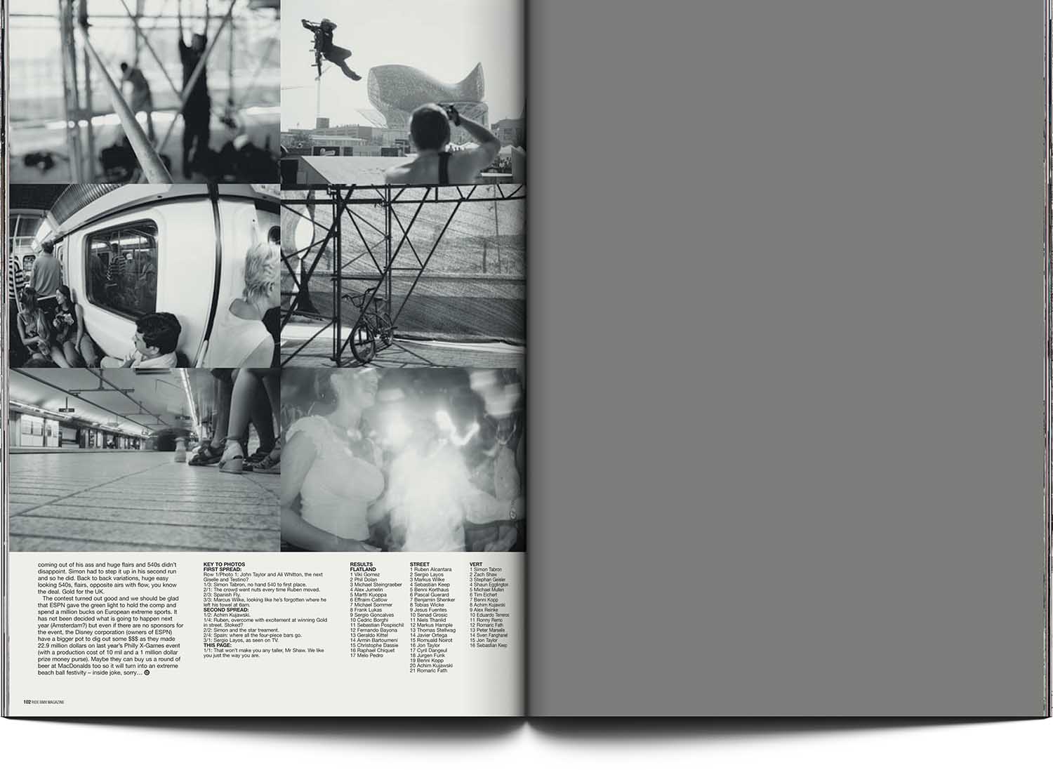
NB: The grey page is an ad page.
[ For Ride UK BMX Mag ]