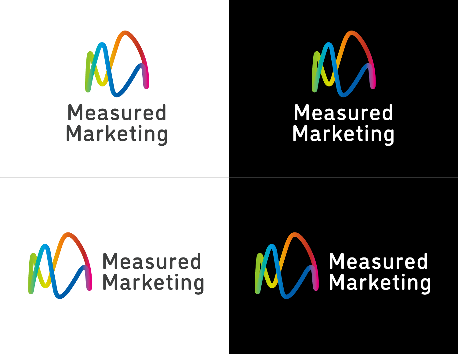
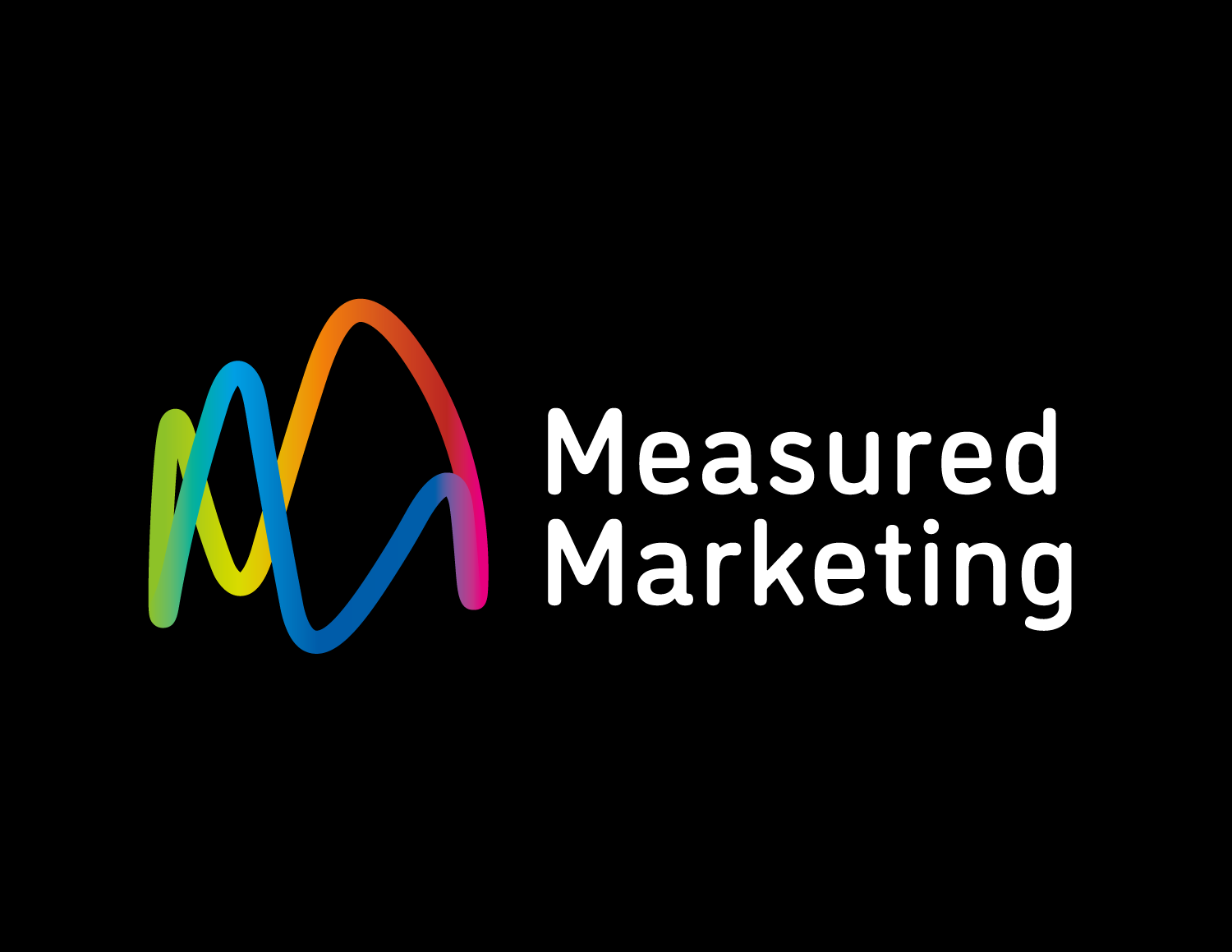
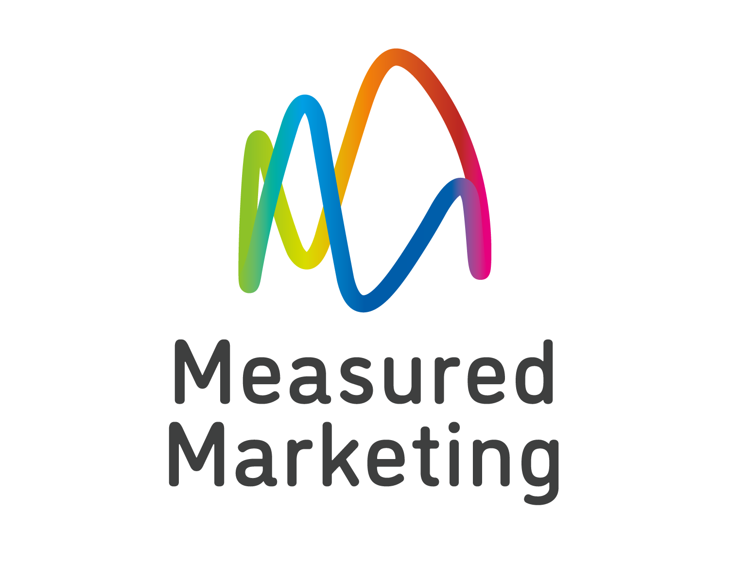
For this brand mark project I got a bit sucked in to the gradient fad at the time (2015) — but with reasoning. Always have to have reasoning to connect the dots — anything else is a distraction.
(Disclaimer: This is effectively round 1. I’d have liked to have developed this further and built a system, animations et cetera, but the owner was offered a dream job, shelved the startup idea and moved from Oregon to Arizona.)
The company’s USP was to adjust its clients’ marketing during their runs to adapt to what was working and what wasn’t. Booking out weeks and weeks of this channel and that channel, uploading the material and maybe assessing it after the fact to inform the next campaign didn’t make much sense to them when live analytics offers live agility ability.
The icon represents analytics data graphs that come in all colours — hence the multi-colour gradient — wrapped around a loop — imagine it wrapped around a drinking glass — to represent the constant, looping analysis of the analytics.
Also, it’s two ‘M’s.
For the typeface, I chose one evocative of data but with rounded corners to sit well with the icon’s curves, and for a more human sensibility.
After all, data is people too.
[ For Measured Marketing ]