Dude, the rejected logos were more cosmic, dude, but, to be fair, they probably wouldn’t have quite fit the people. They’re more straight-laced than that. So here we have another regional tech brand do-over.
Cosmic started as a community internet cafe (providing three of the letters in the name, the “osm” coming from their location). But since the days of those places where your one coffee lasted forever, they’ve evolved to provide all sorts of services to biz big and small, as well as serving the community per their original remit.
Being a naturally growing company in the boonies in Devon, far, far away from any creative cutting edges, they were content with their aging logo and brand. That was, until they saw Program agency’s newly revealed brand and they got all excited and had us give theirs a refresh.
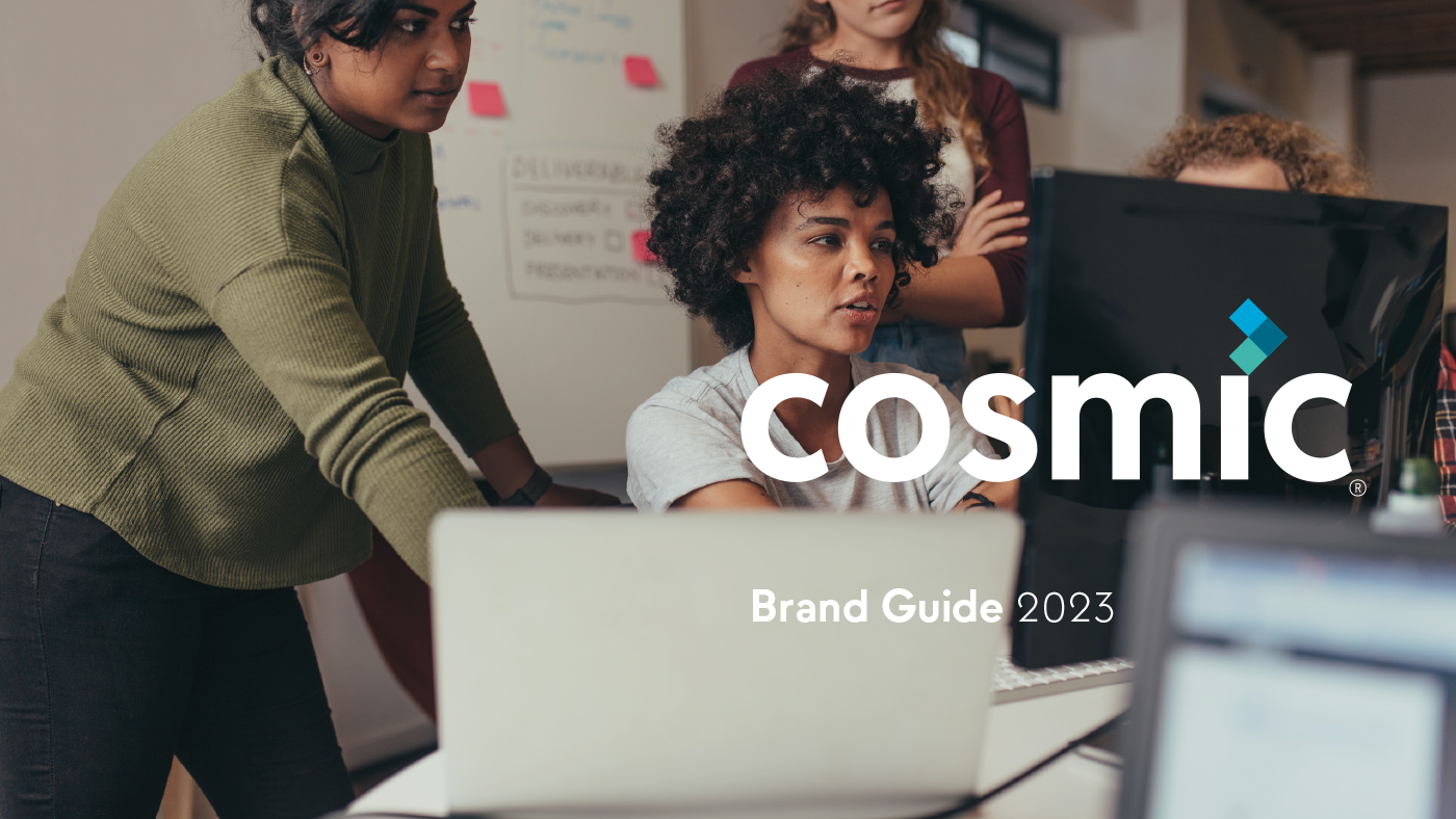
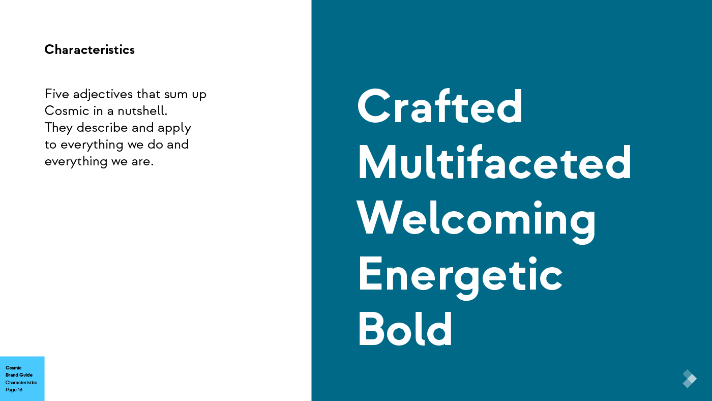
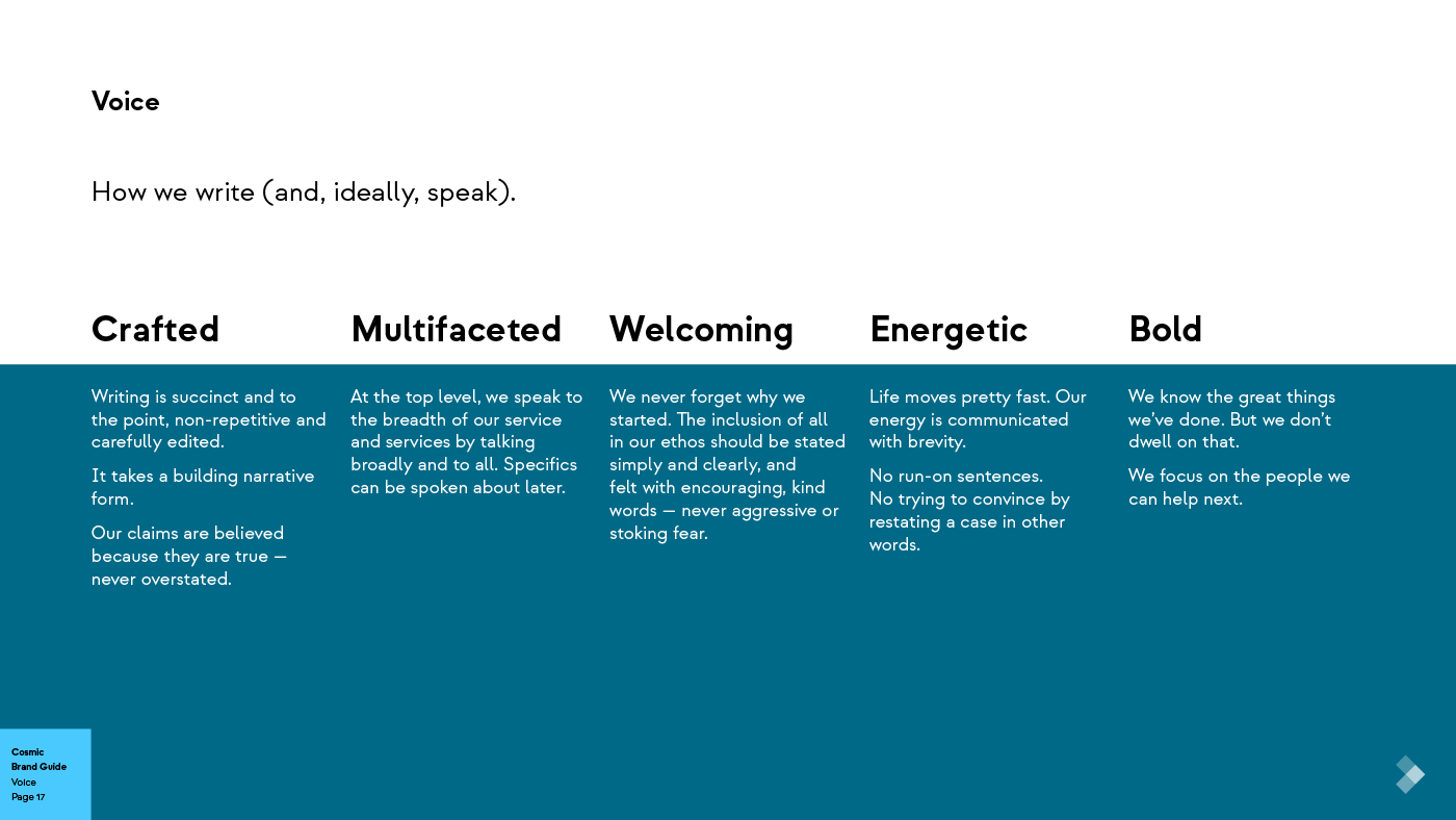
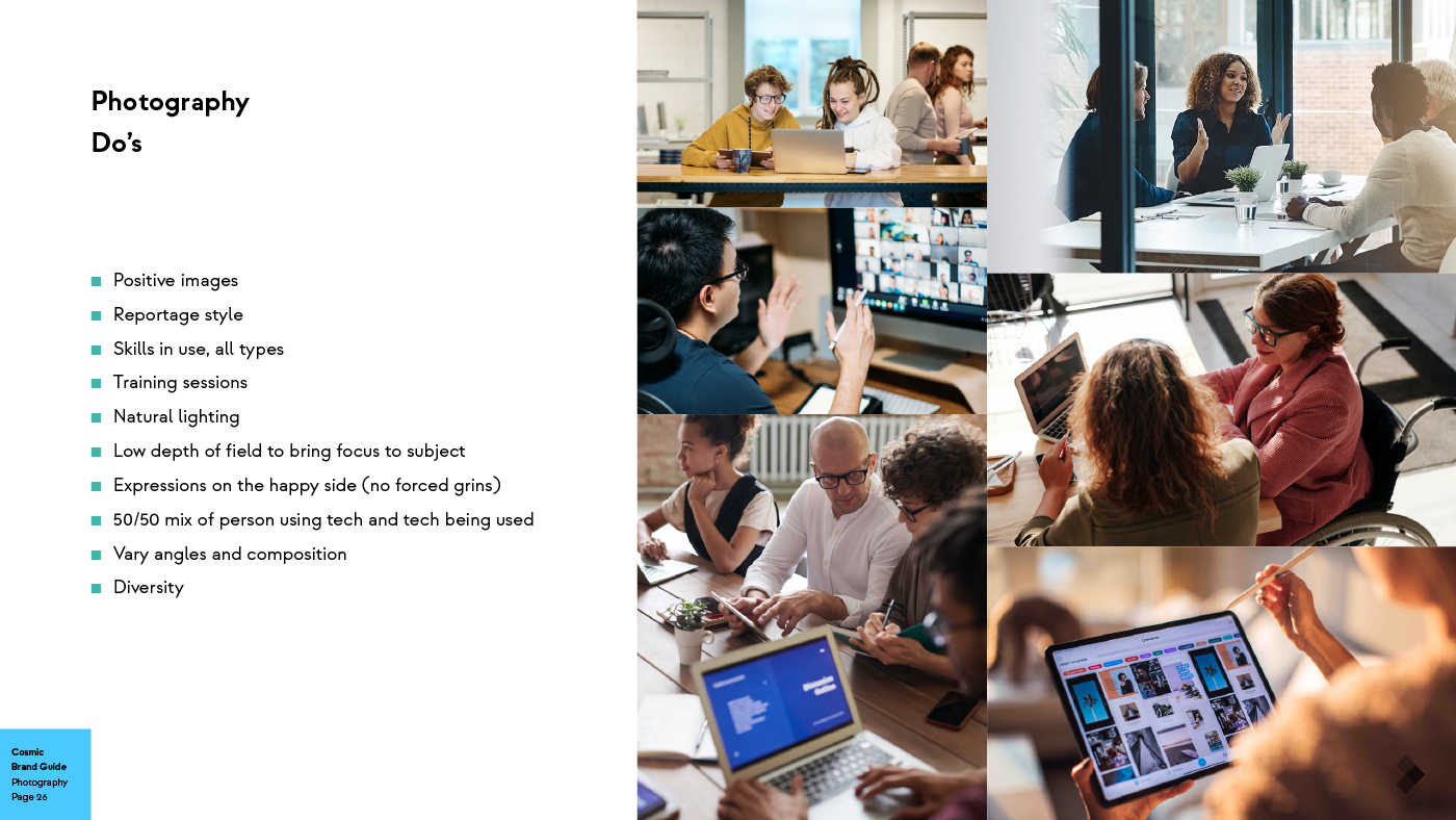
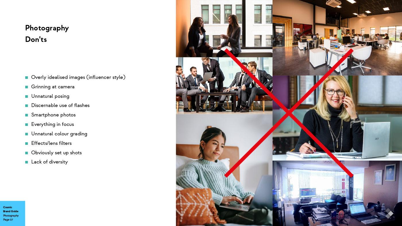
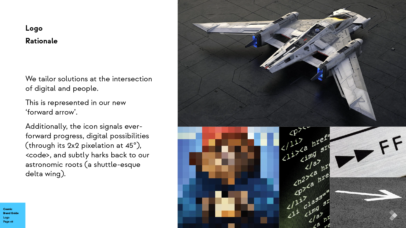
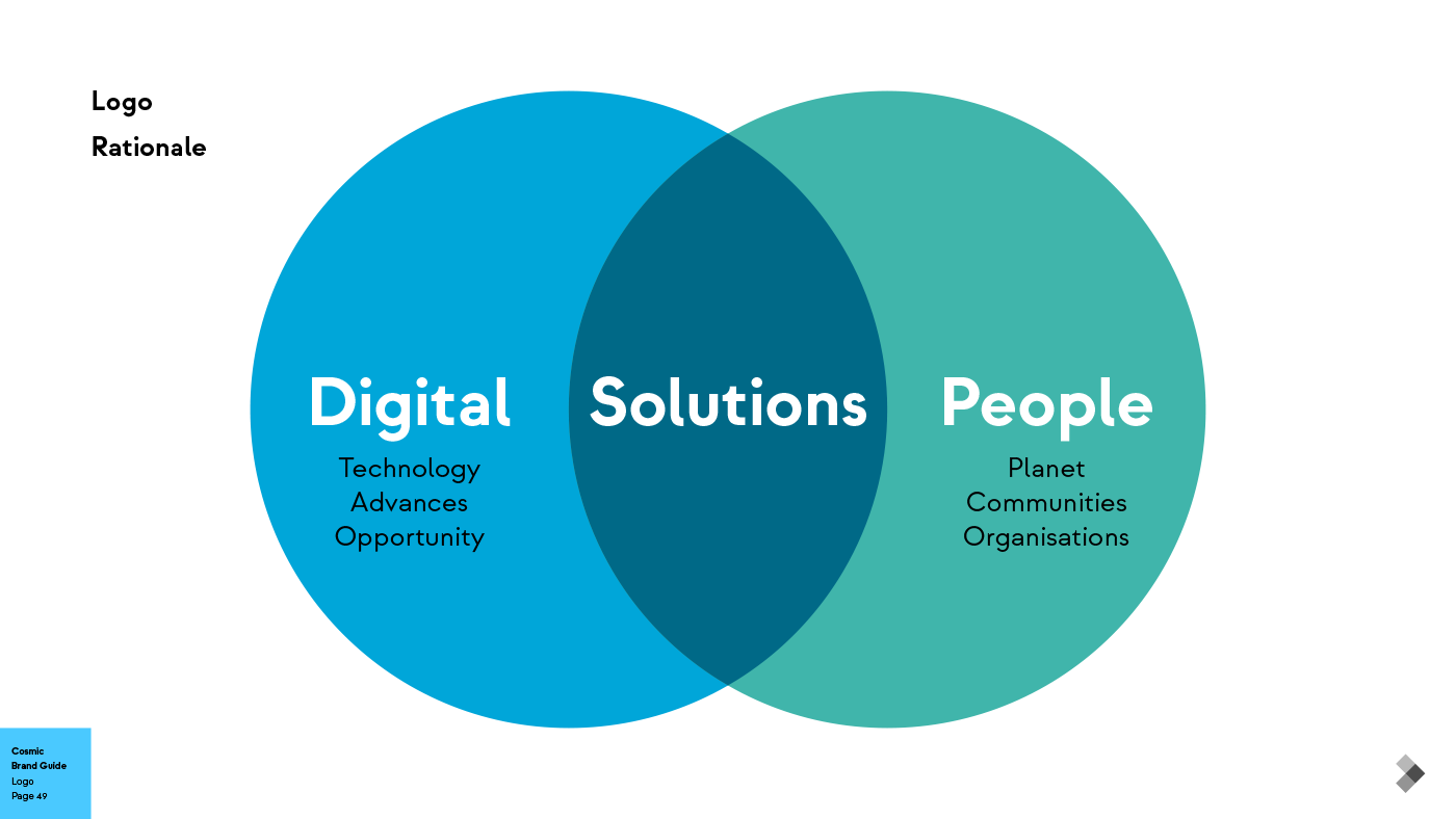
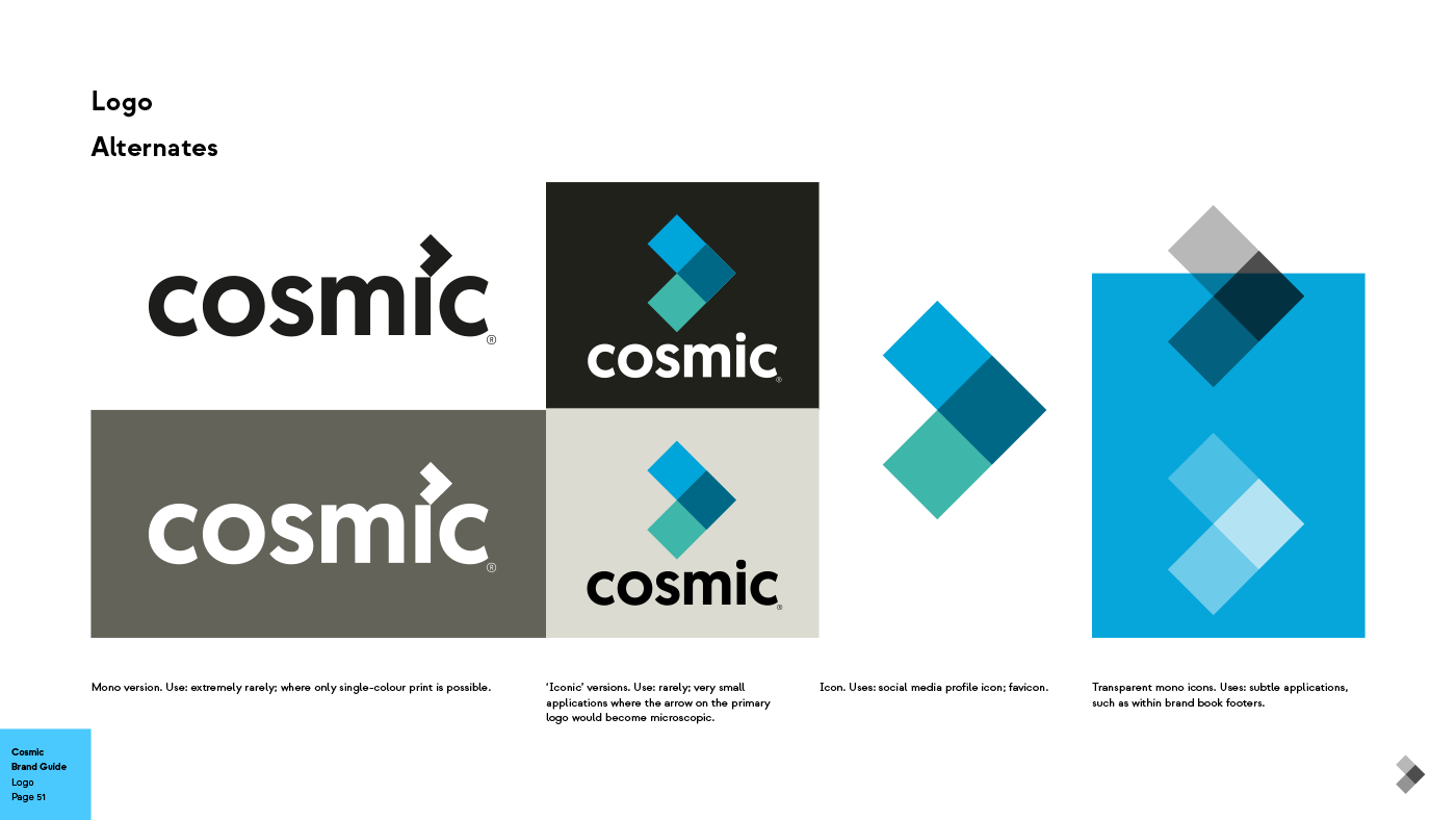
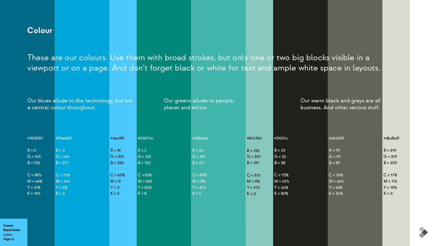
While I tried to steer them toward more funzy options — with lots of rationale and vibes — they felt more comfy staying fairly close to their old logo. We gave them all-new defining statements, marketing blurbs for all occasions and brand direction wrapped, of course, in a nice 60-page book with a bonus mellow rebrand intro animation.
They were going to have us (Program) redo their website, but I don’t know what happened to that intent. So don’t look at it.
[ For Cosmic/Program ]

