Like most enthusiast magazines, Snowboarder Magazine reviewed a lot of kit.
These are a few of the graphics I designed for them.
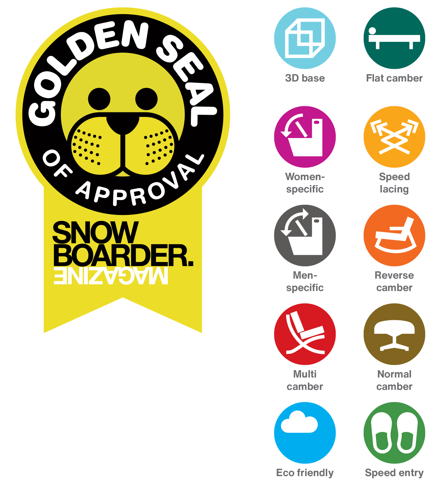
The ‘Golden Seal of Approval’ icon won the Nobel Prize for Slightly Cheesy Graphic Solution Excusable by Adorableness. The plaudit itself was awarded to the best of the best products, and this logo was slapped on the product’s packaging as a badge of pride (and a selling point).
The icons were used to denote various product features in group reviews. Speed entry? Slippers. Throw in some mid-century furniture to represent the different board profiles and a loo for gender-specificity, and you’ve got yourself a set of fun, thoughtful icons.
[ For Snowboarder Mag ]