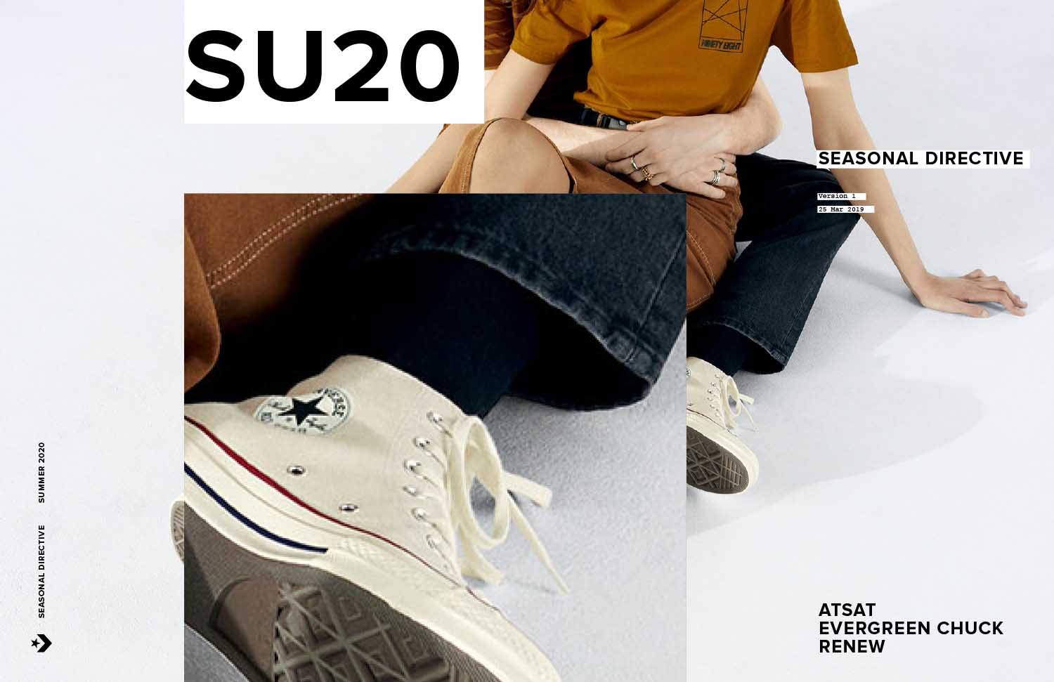
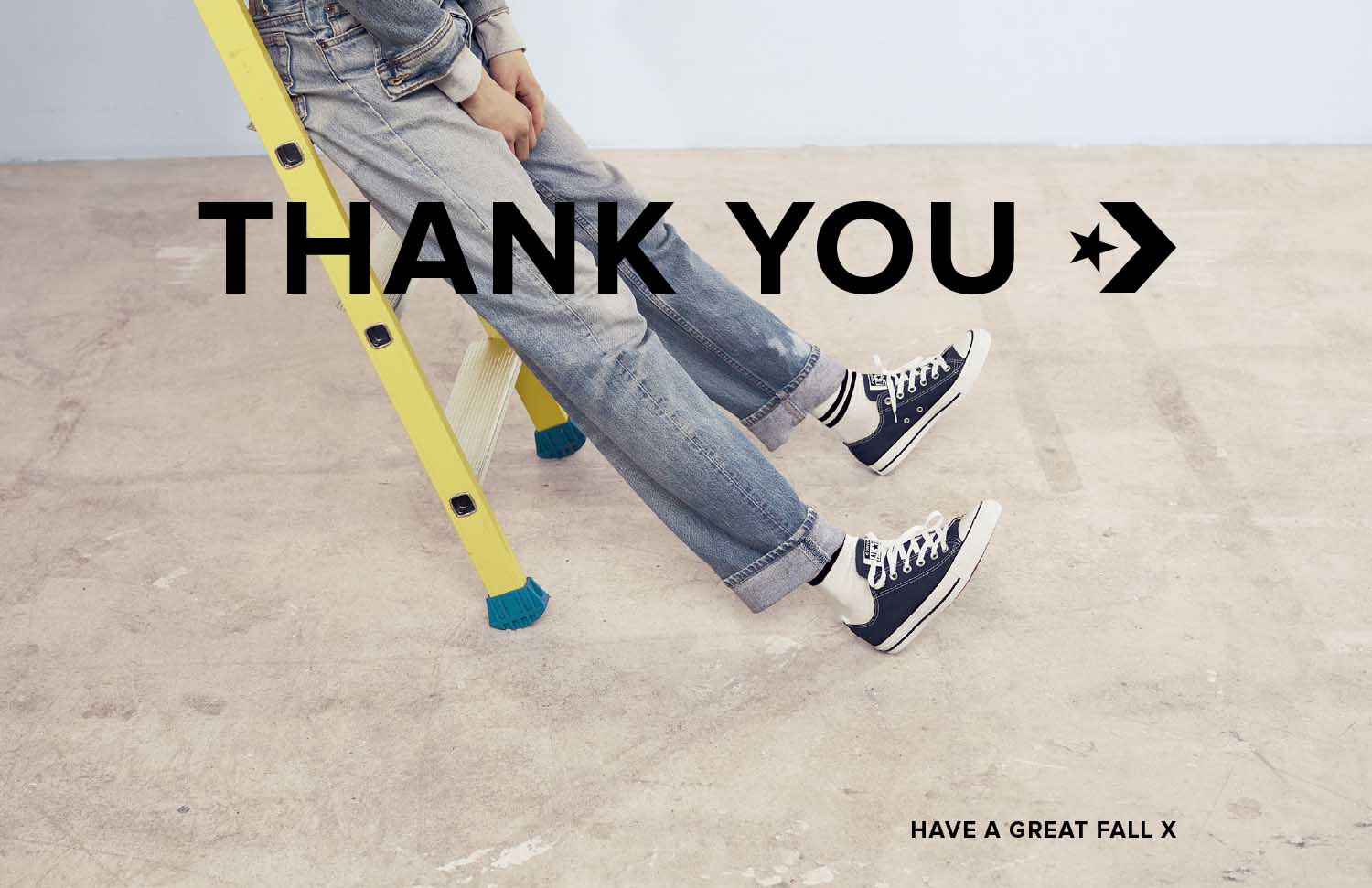
Every time many big brands release a thing or a bunch of things, they’ll release a directive doc showing how to market that thing or things — strategy, socials, retail, ecomm … all the things. You get it. To ease the creation of these docs, brands need a template, refreshed every so often. To ease the creation of a seasonal directive template, Converse agency Big-Giant (Portland, Oregon) tapped me up.
Anyway. Converse are a funky bunch — not Marky Mark style — more disruptive über-street-smart trend-leader style. So with that knowledge and brief I built unexpected layouts with retained practicality, clever discovery bits (a bit*) and effortless modularity. Fire.
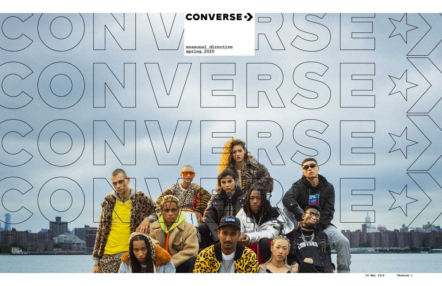
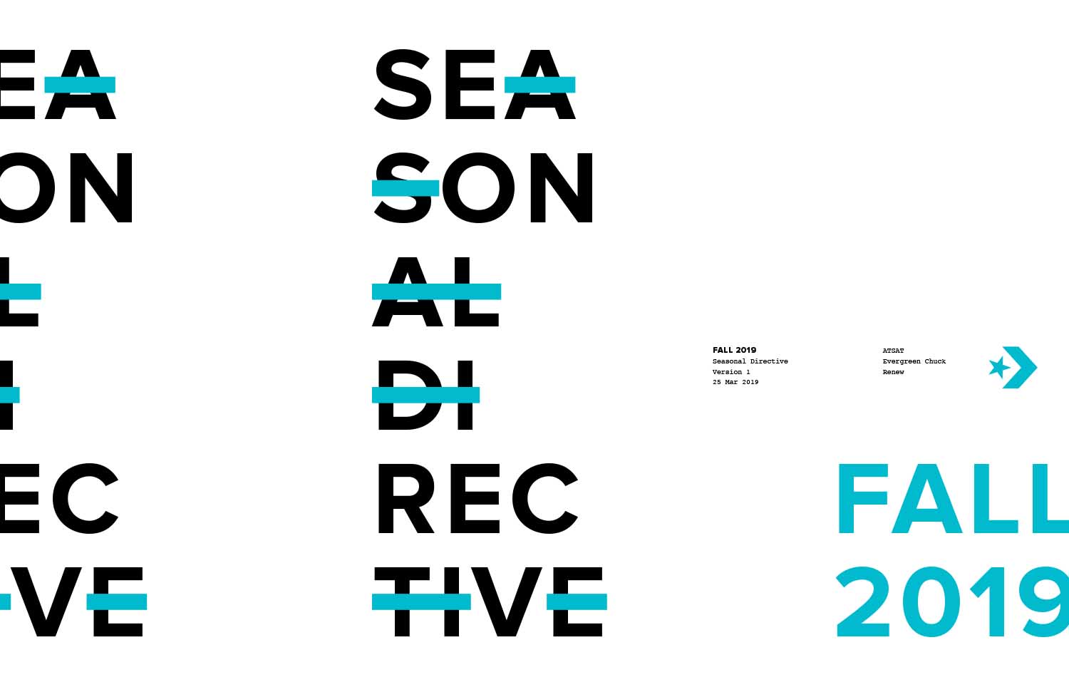
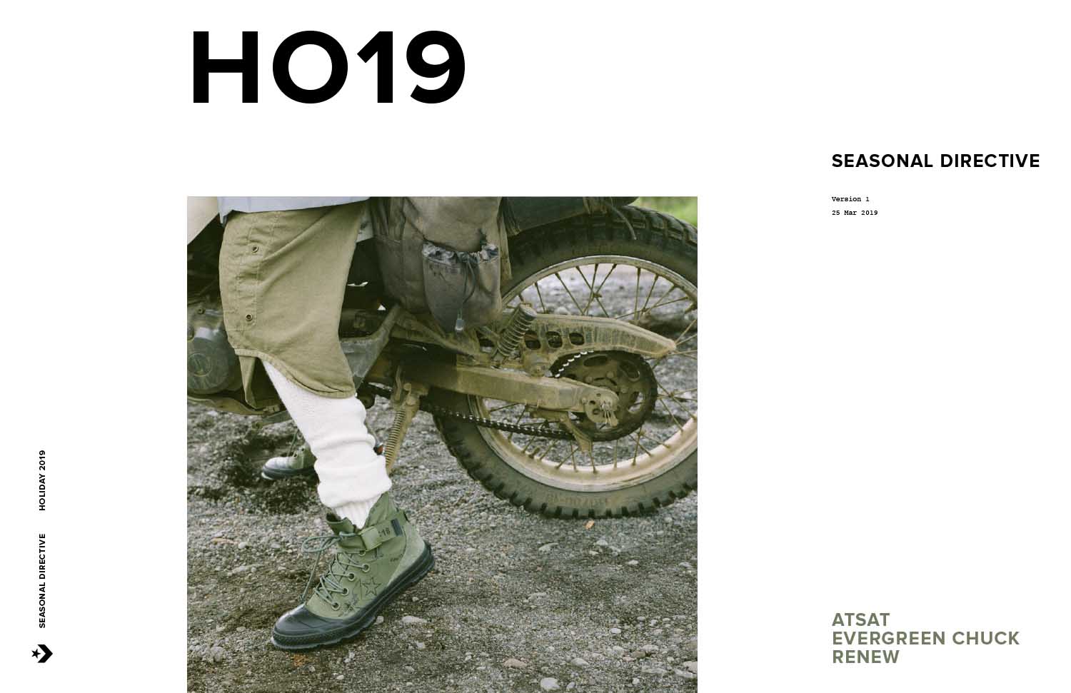
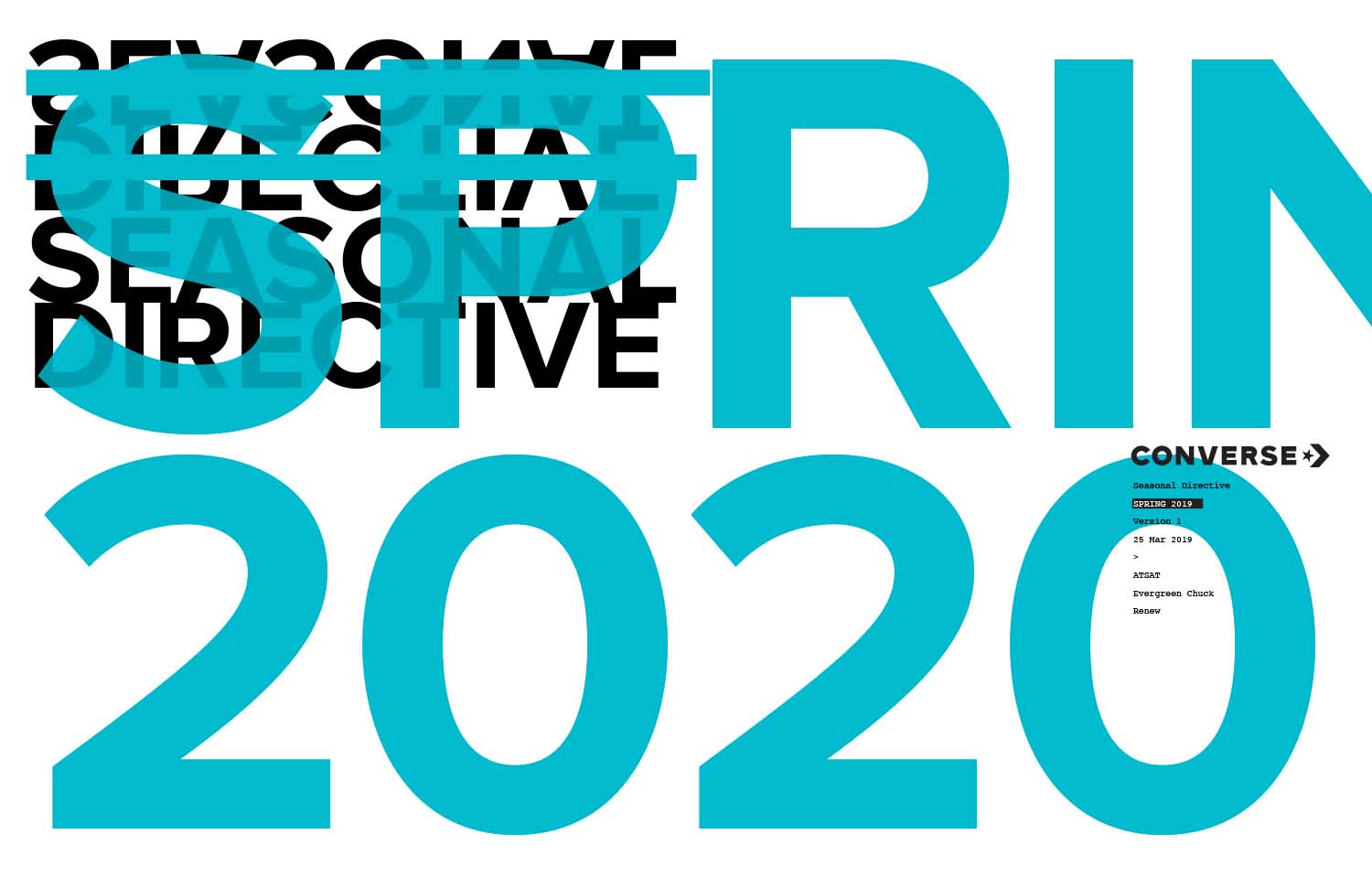
Here are a few options submitted for the directive covers — round 7. I did inside pages too, but they’re less exciting and possibly a bit more hush-hush.
*Behold how the one with the crossed-out letters in “SEASONAL DIRECTIVE” leaves the letters that make up “CONVERSE”. Who’d notice that? Delighted people. (Or maybe people rolling their eyes, I don’t know. Some people hate puzzles, or at least they pretend to. Who hates puzzles?)
Anyway. For cover pages it’s dead easy-ish to do a bleed of a key image with some type over the top (works for some, but Converse asked for something not that) or a nicely typeset text box with nothing else (maybe a pattern!), but I sent them unexpected solutions, as is my wont. Layout to grab attention. Dynamic crops, overlays, bleeding text. Think: different!
[ For Big-Giant/Converse ]