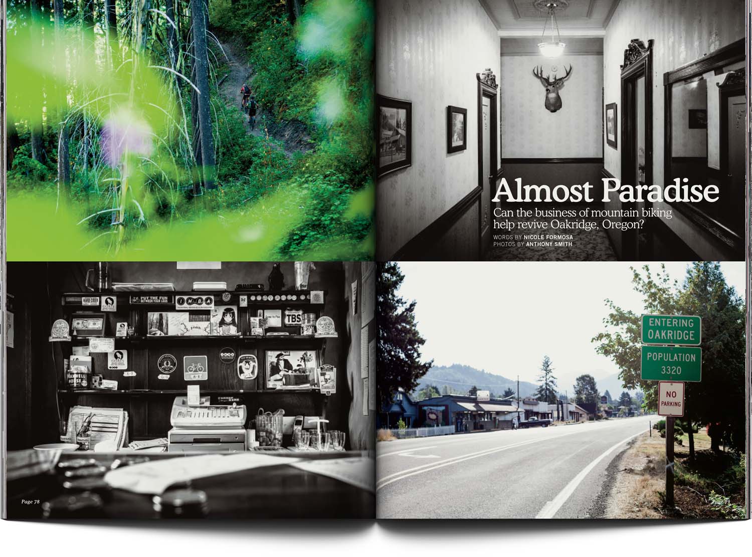
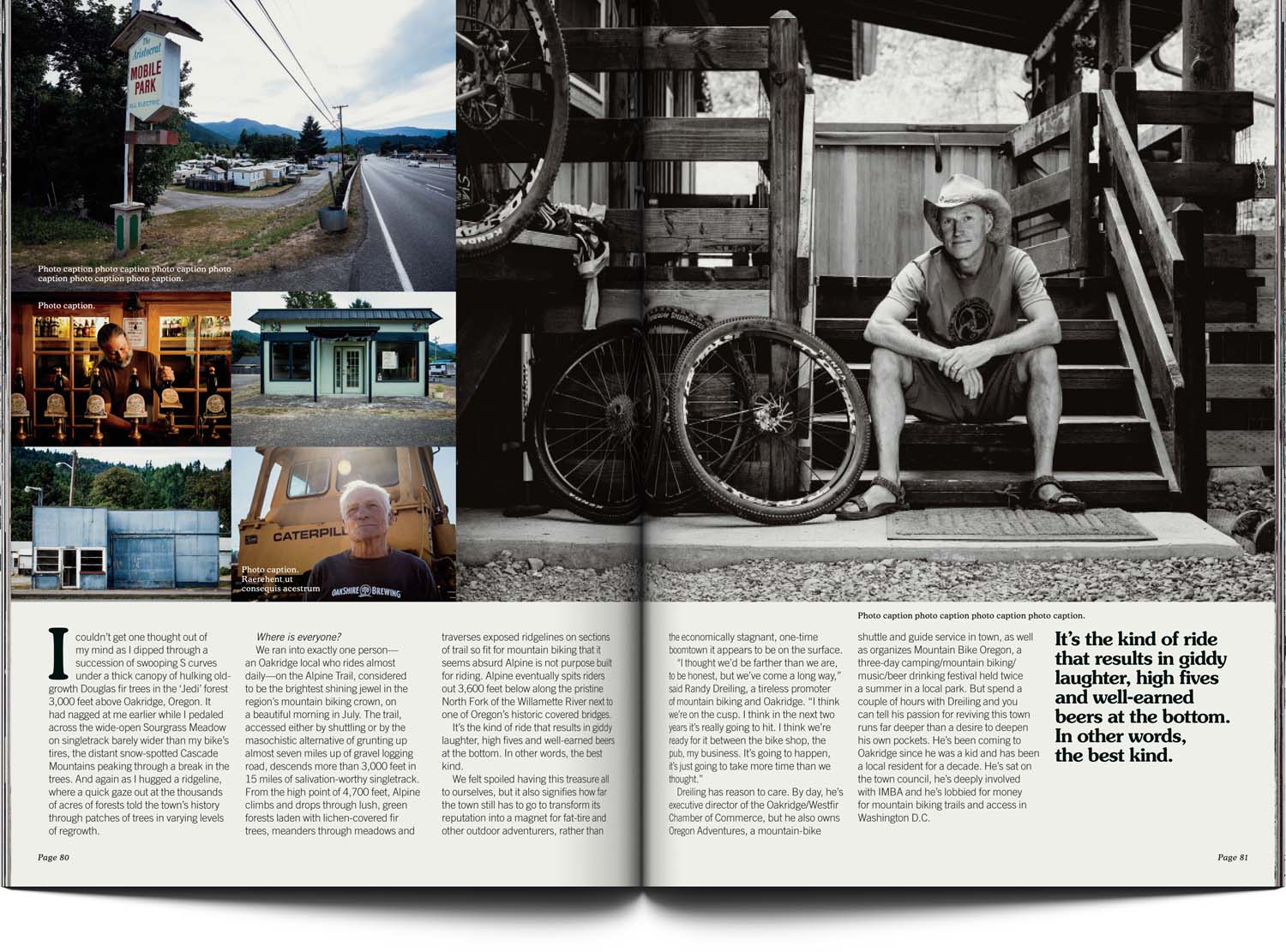
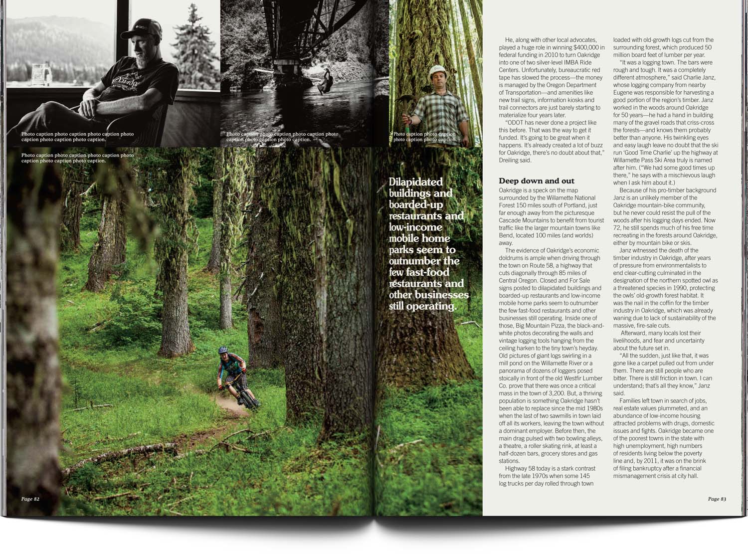
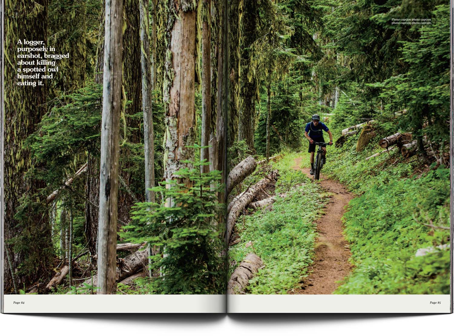
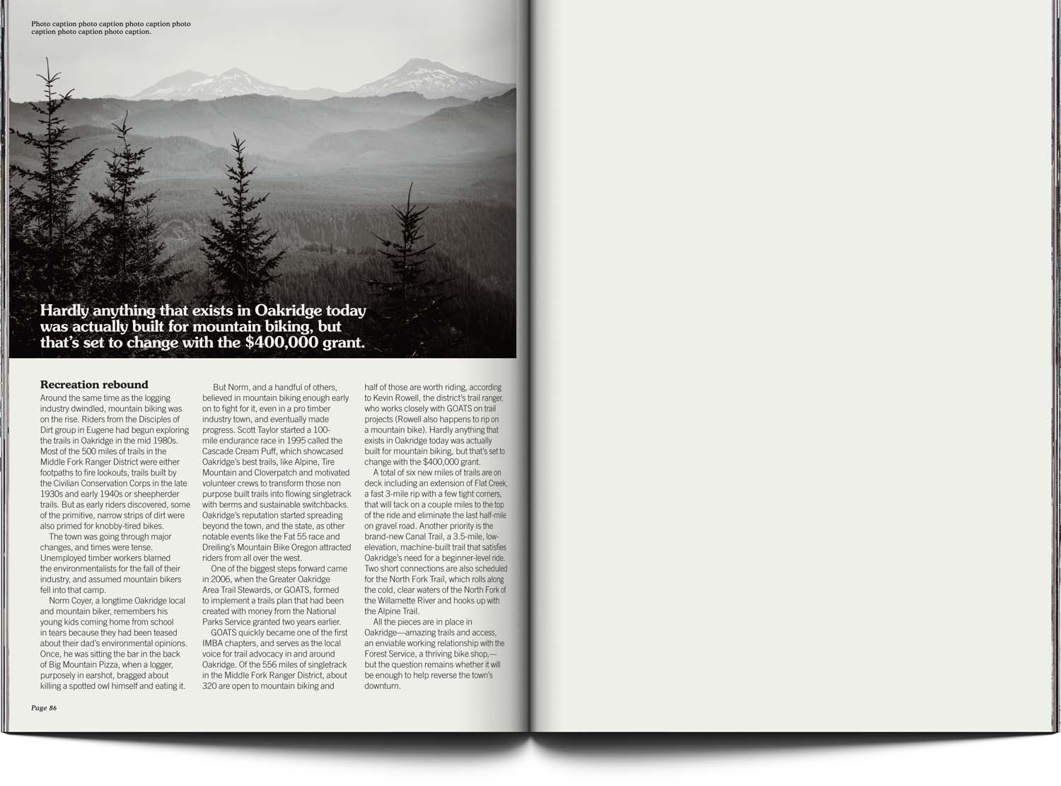
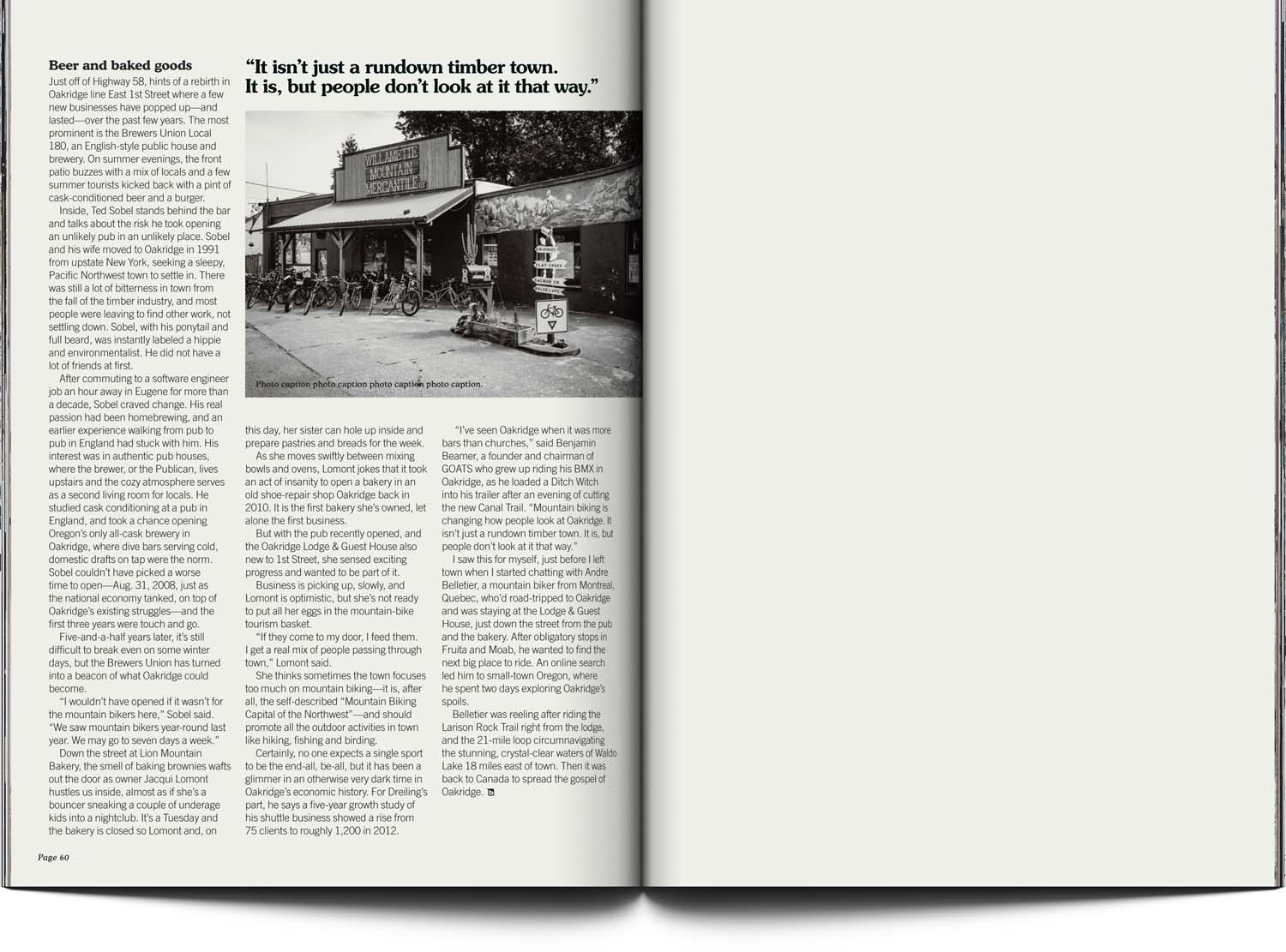
At the time, I was living a couple hours up the road from the subject of this article, so I felt I had a good handle on an apt feel for it.
The old-timey streets and forests of Oakridge, Oregon, USA are well suited to a classic yet rarely used title font*, a well structured but not repetitive layout (reminiscent of old postcards) and perfectly paced picture placement.
I was able to apply my favorite approach — simplicity — to bring feel, focus and little bit of gravitas to this report.
*Cooper Black and Black Italic found fame in kooky action sports settings in the ’80s, but its lighter-weight brethren never found the limelight. The soft-serif font style has regained popularity over the last few years, so they may well have popped up on a yoghurt pot or hip café recently.
[ For Bike Magazine ]

