Snowboarder magazine took a spring break every year as the snow melted and next year’s gear was yet to be launched. After the break, every new volume got a fresh look.
For my first three years as its Art Director, I gave the magazine the standard refresh: new headers, footers and front-of-book templates. Features got the same treatment across those volumes: consistent body text styles with article-inspired title and graphic elements design.
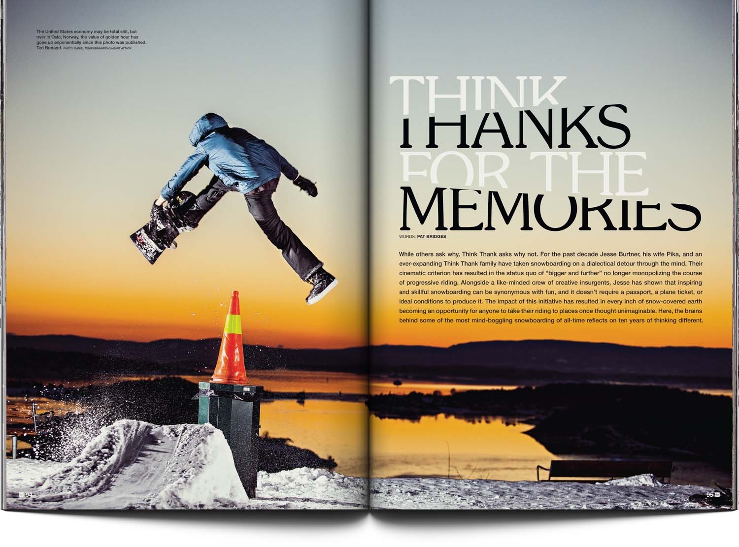
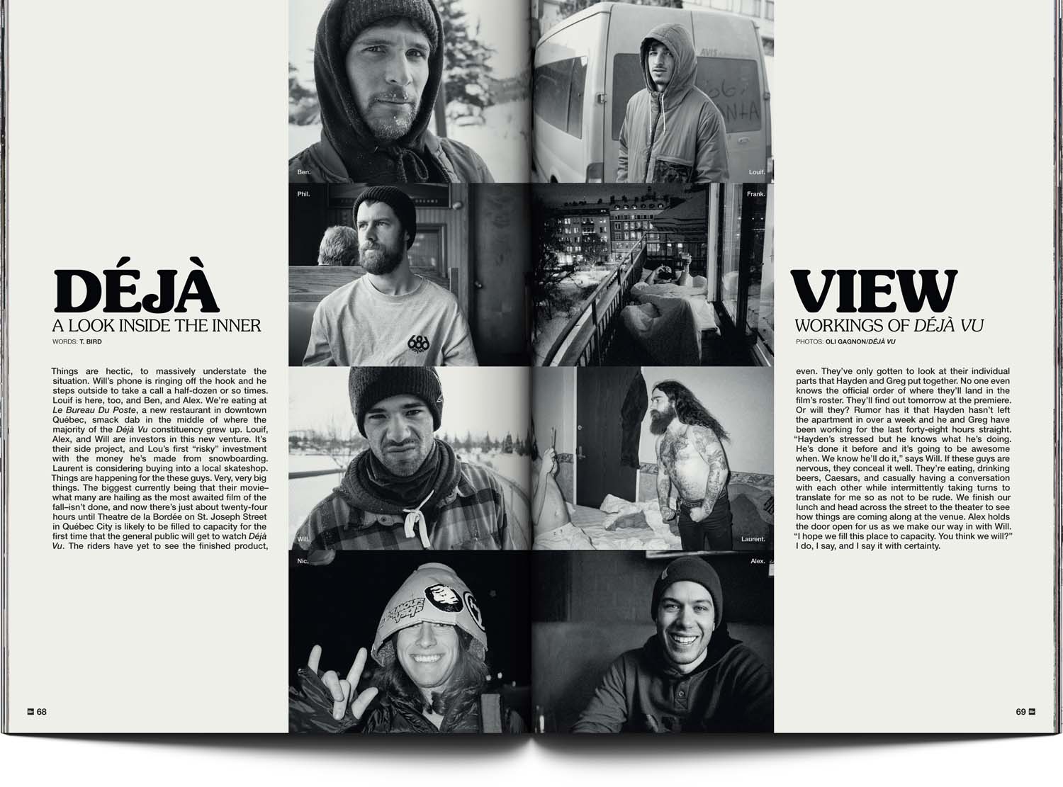
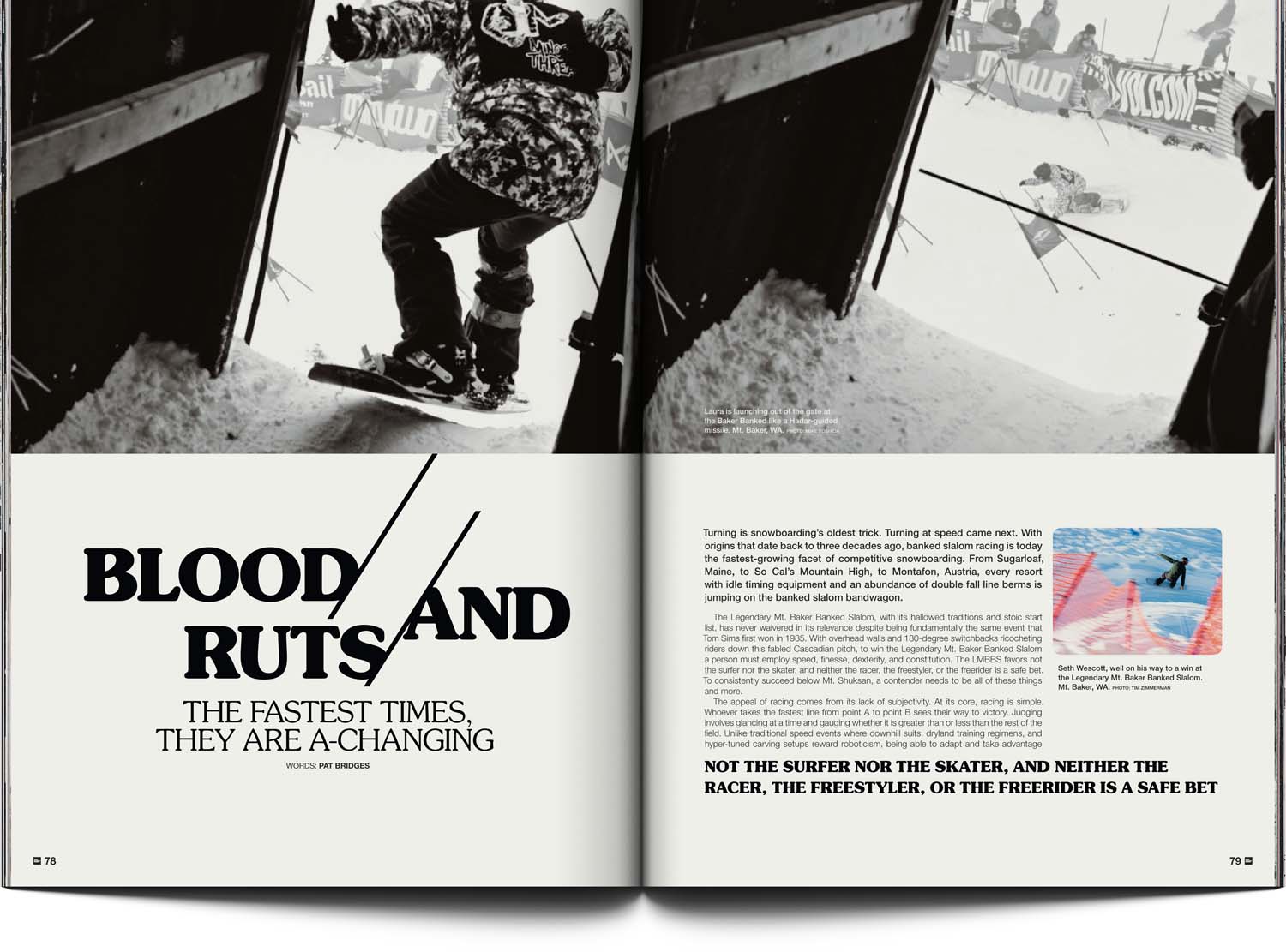
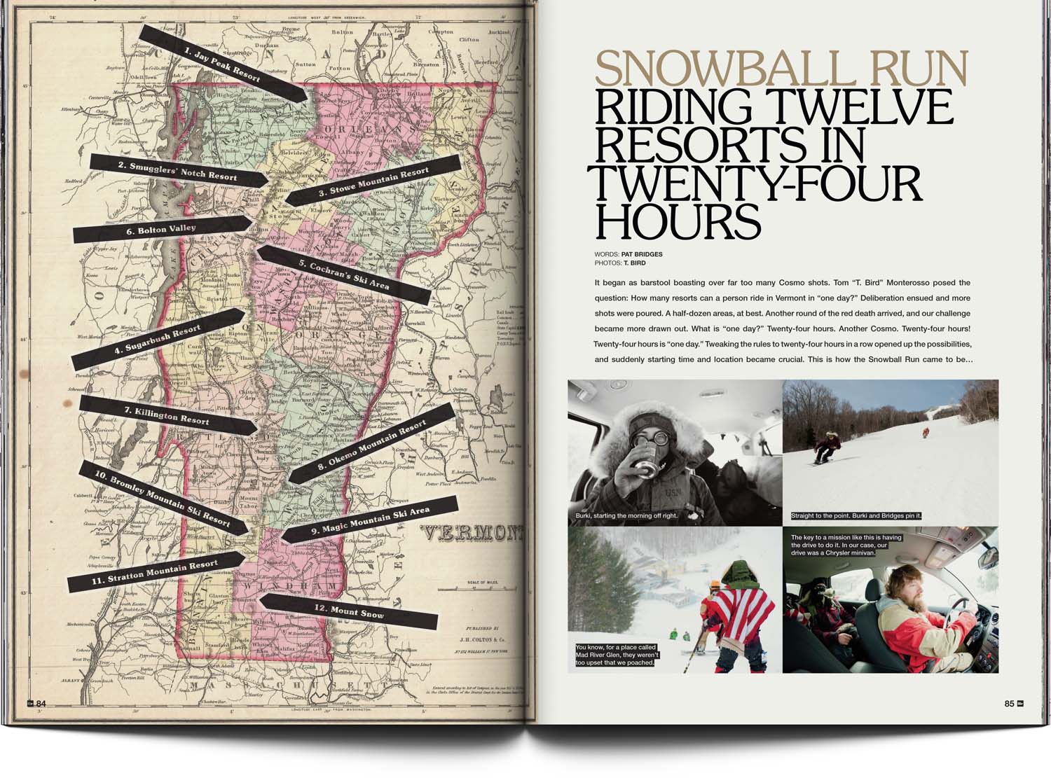
I gave volume 26 a more consistent, sophisticated (slash-retro) design and played with typography and layout sympathetic with each story. The typeface Souvenir was promoted from forgotten ’70s staple to title hero, with each article getting a treatment inspired, sometimes subtly, by the subject matter.
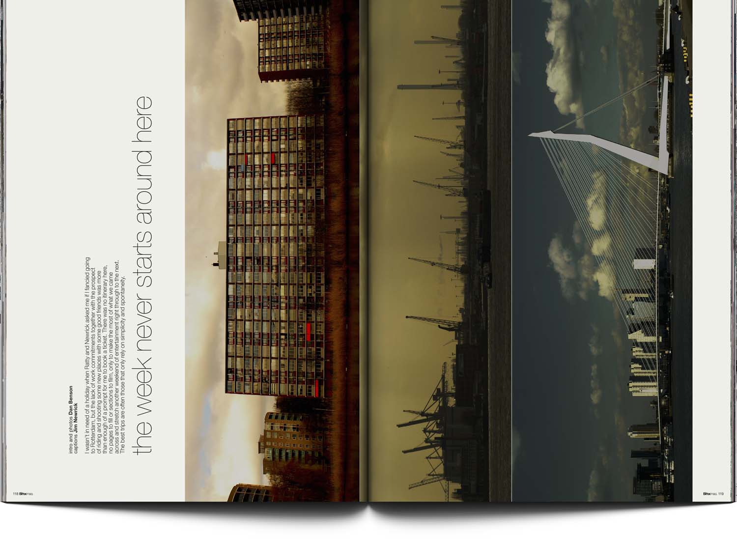
Shown here: ThinkThank brand name-inspired word-slicing-merging; a spine-mirrored layout for a Déjà Vu crew piece; slalom poles for slalom race; old-school road trip planning map with typography like a ‘What I Did Last Winter’ report printed out of Word 1.0.
[ For Snowboarder Mag ]