Telling stories is as old a skill as language itself. Still, getting a story told with a photo and a few words can be a challenge.
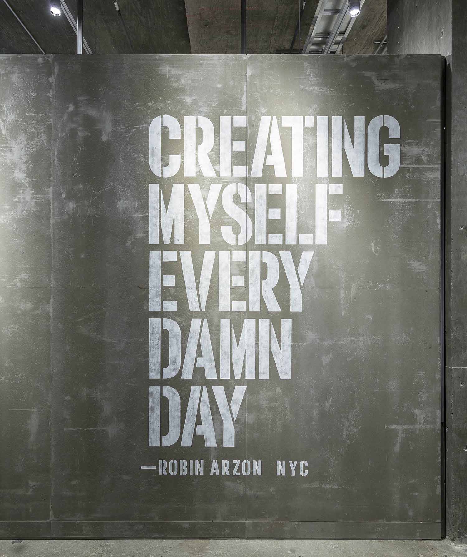
Judging by geo-tagged social posts around that time, the women’s mantra was quite liked by store visitors. Many posed for their Instagram-perfect photo in front of that wall. Robin Arzon said it, I designed the graphic and execution for a ten-foot-tall wall, and visitors loved it.
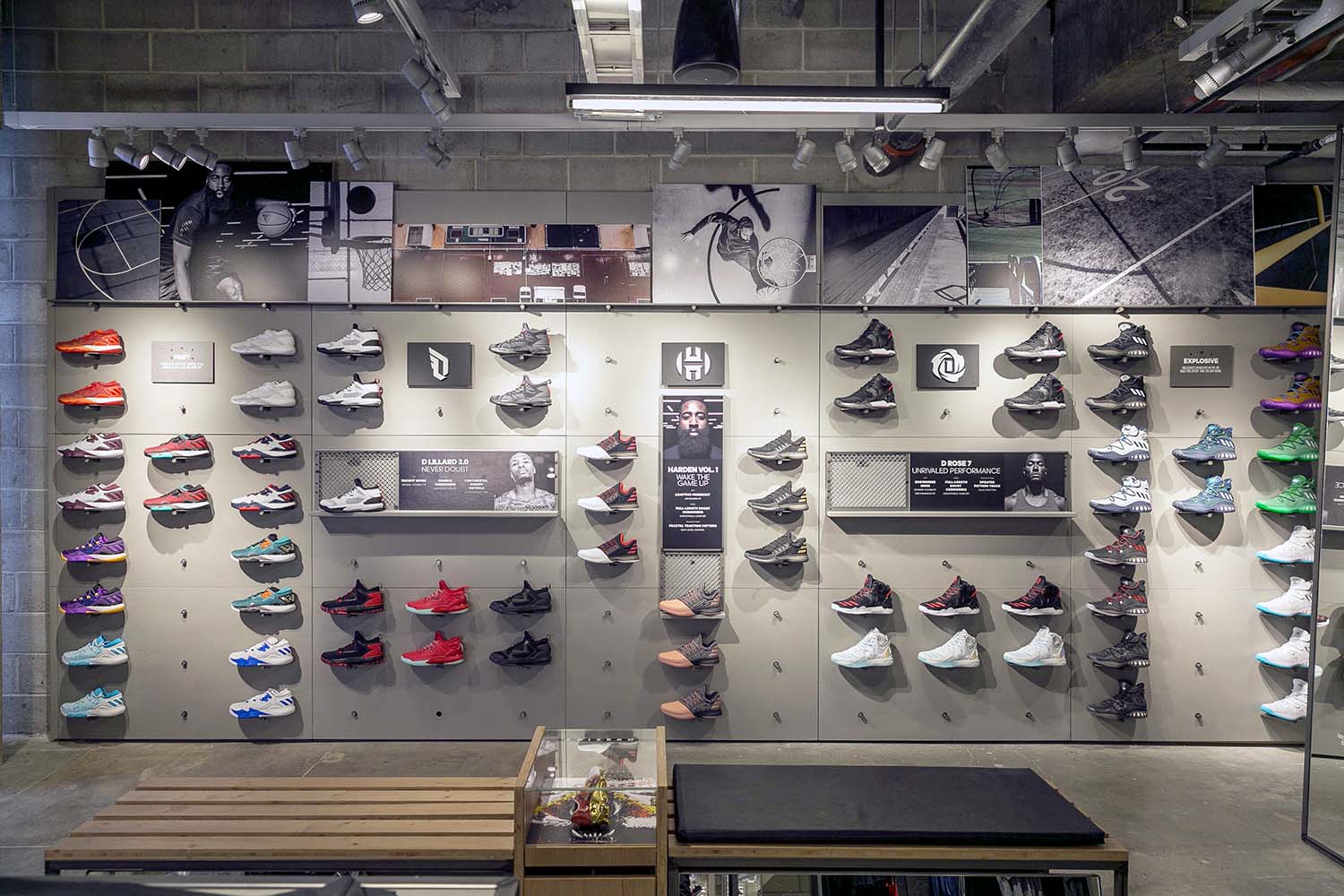
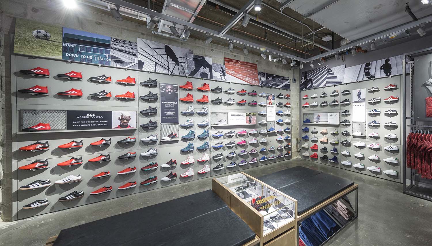
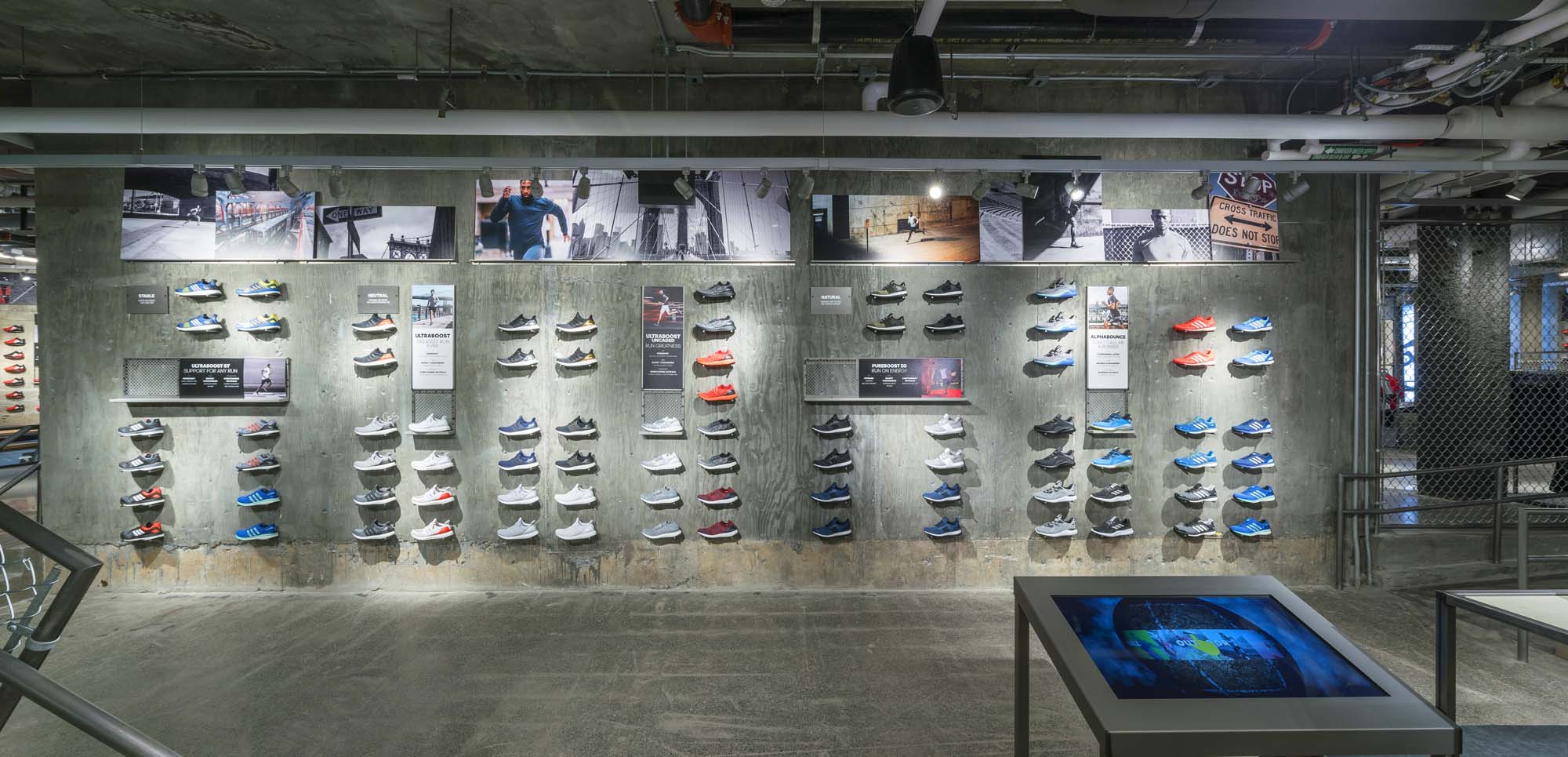
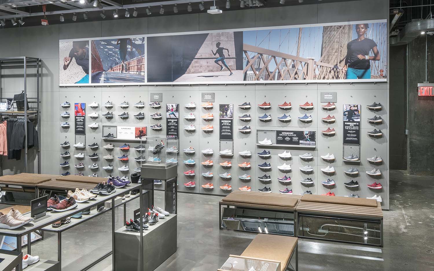
Moving onto the all-important footwear walls, adidas corporate were expecting graphic lightboxes for the flagship — the norm for retail. The flagship store’s Design Director and I saw eco-friendly card-core panels were a better fit for the ‘raw’ look and feel of the store, inspired by high school sports stadiums.
The solution also suits adidas’s status as an outstandingly green company in its most prominent location. I’ll always push for greener ways, so I was glad when this sailed through the approval process.
The photo print design tells an evergreen, dynamic, brand-, city- and culture-correct story of sport. The women’s wall, with its high ceiling, was topped with a single giant print.
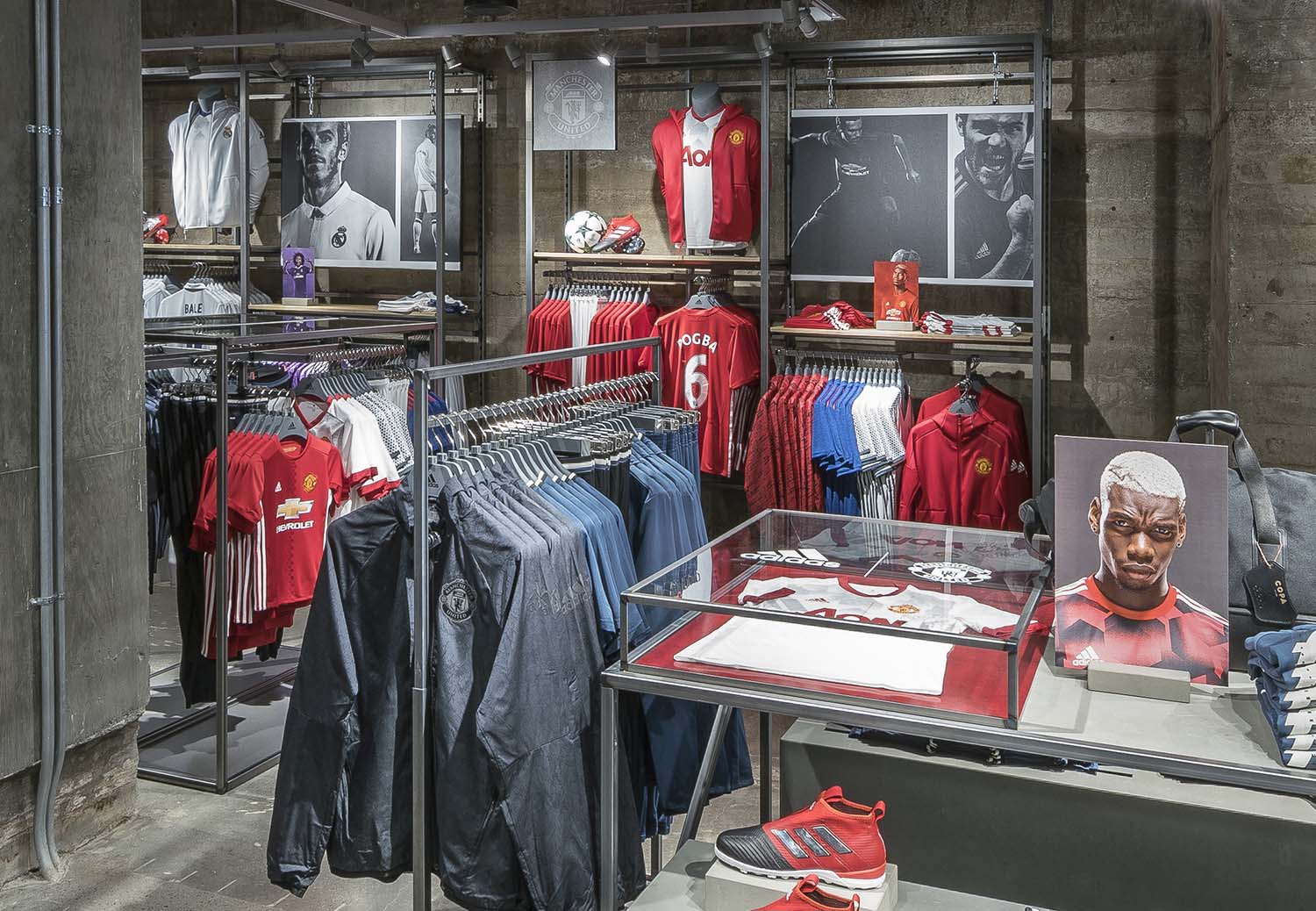
The various categories’ retail departments supplied comprehensive design guidelines for wall comms pieces, but they were also not hitting the mark and were disparate in design. Starting from scratch, I created a new, sophisticated design and copy template.
Both of these templates were adopted by adidas globally; I wrote and built the guidelines.
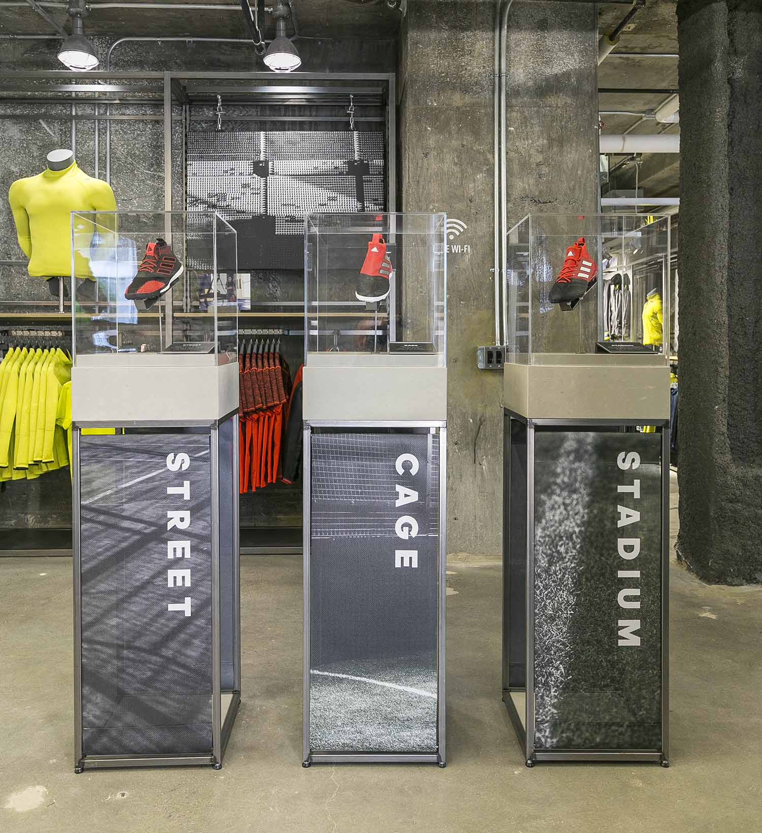
My graphic work could be seen across the store, from photo panels to shoe plinth creative. Grabbing imagery from the adidas online database — and hustling around and scavenging shots from category creatives when officially uploaded images weren’t cutting it — was all part and parcel of telling the tale.
[ For adidas ]