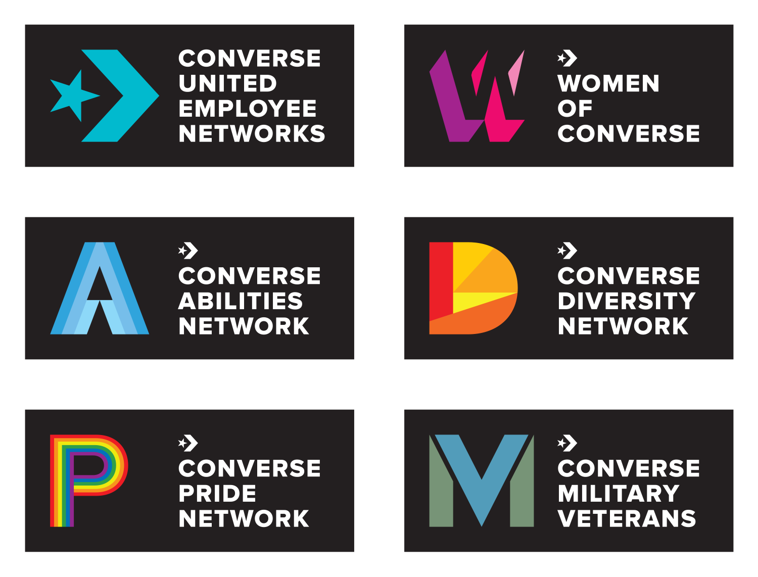
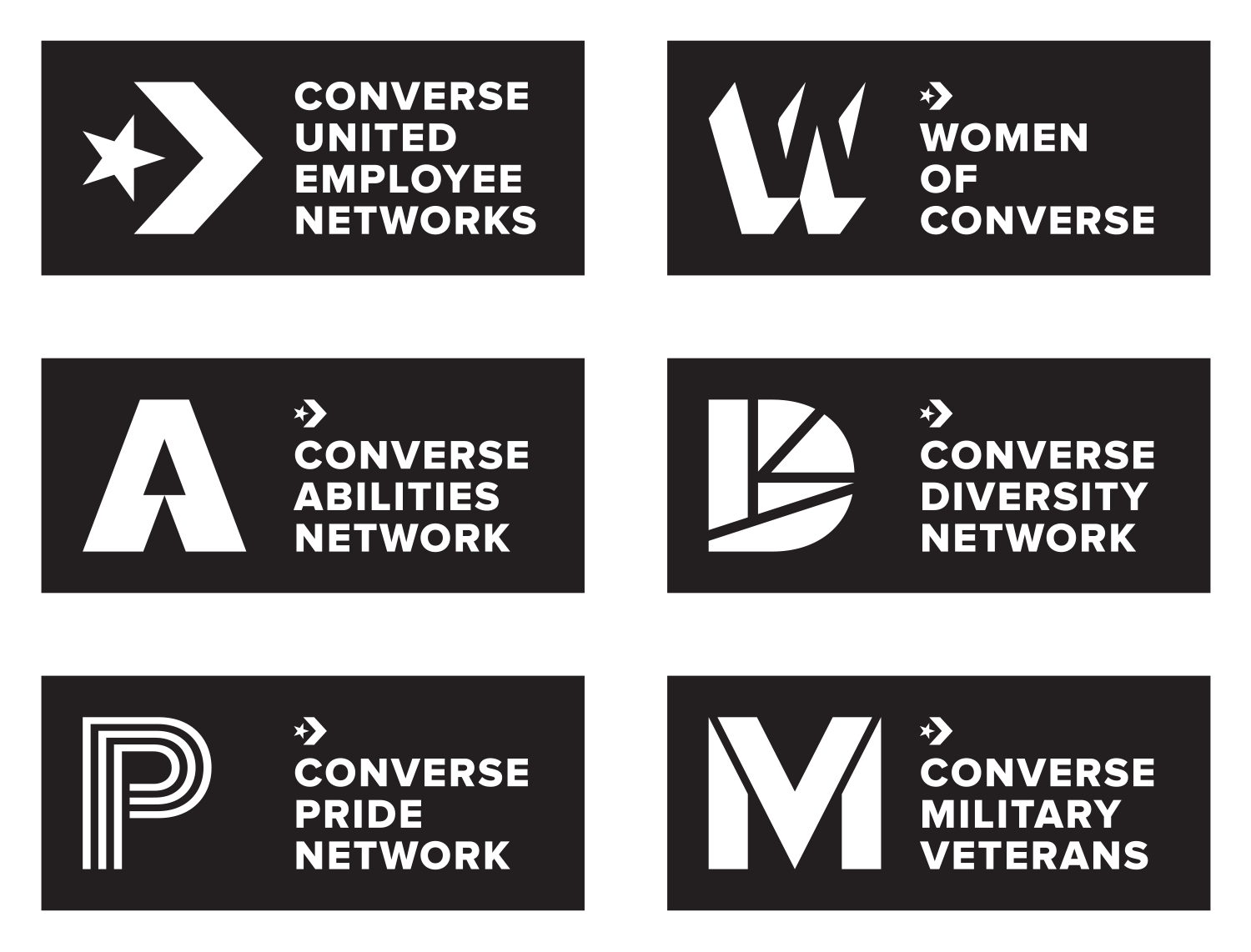
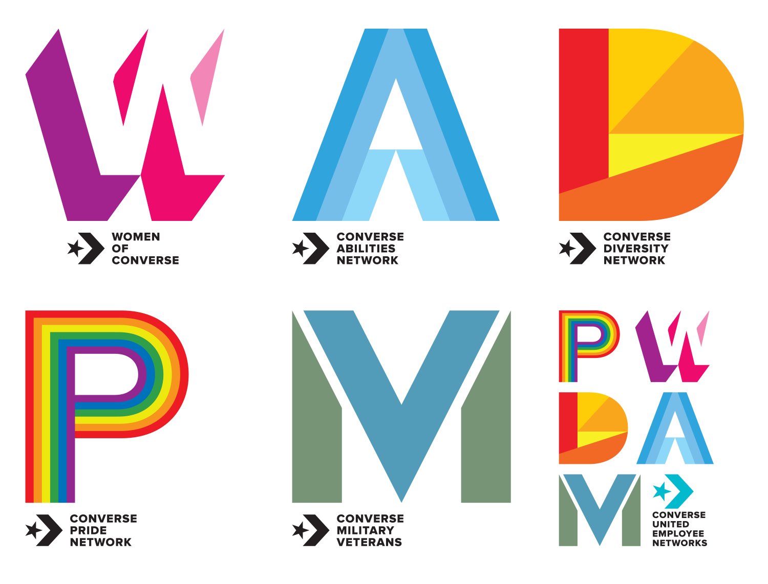
Converse’s employee groups’ logos needed upgrading and systematising. (They really did.) Only the women’s group ‘W’ was semi-recycled as everyone at Converse liked that one; everything else is new.
The icons’ designs reference aspects of the star and chevron of the Converse logo, and all use the Cons typeface (Proxima) as a starting point.
They liked the logo set so much that they wanted to out on an internal launch presentation party. As an unexpected gift to them, I made a video for the logo system celebrating the design system.
From top: the intro video (built in After Effects); colour versions; mono versions; “celebration” lockups.
[ For Converse ]